
Dingle Distillery From The Edge
Threebrand were briefed to refresh and amplify the Dingle brand and Distillery’s unique character through its packaging and web expression. Helping to elevate its premium-ness and visually expound its ‘Made of Dingle’ positioning.
Proudly located in the heart of the Gaeltacht and along the Wild Atlantic Way, Dingle Distillery is inspired by its locations rugged beauty, the rich traditions of the town, and its deep sense of community.
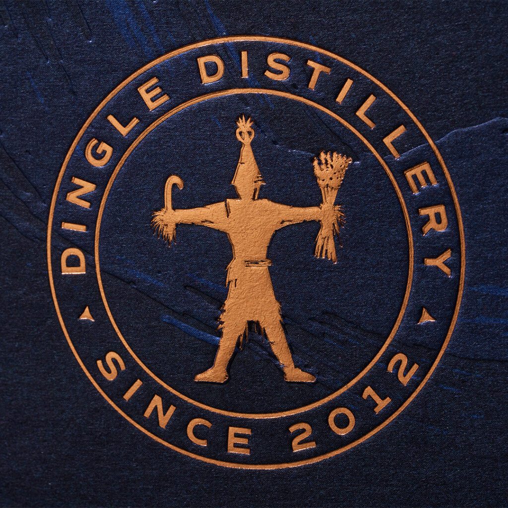
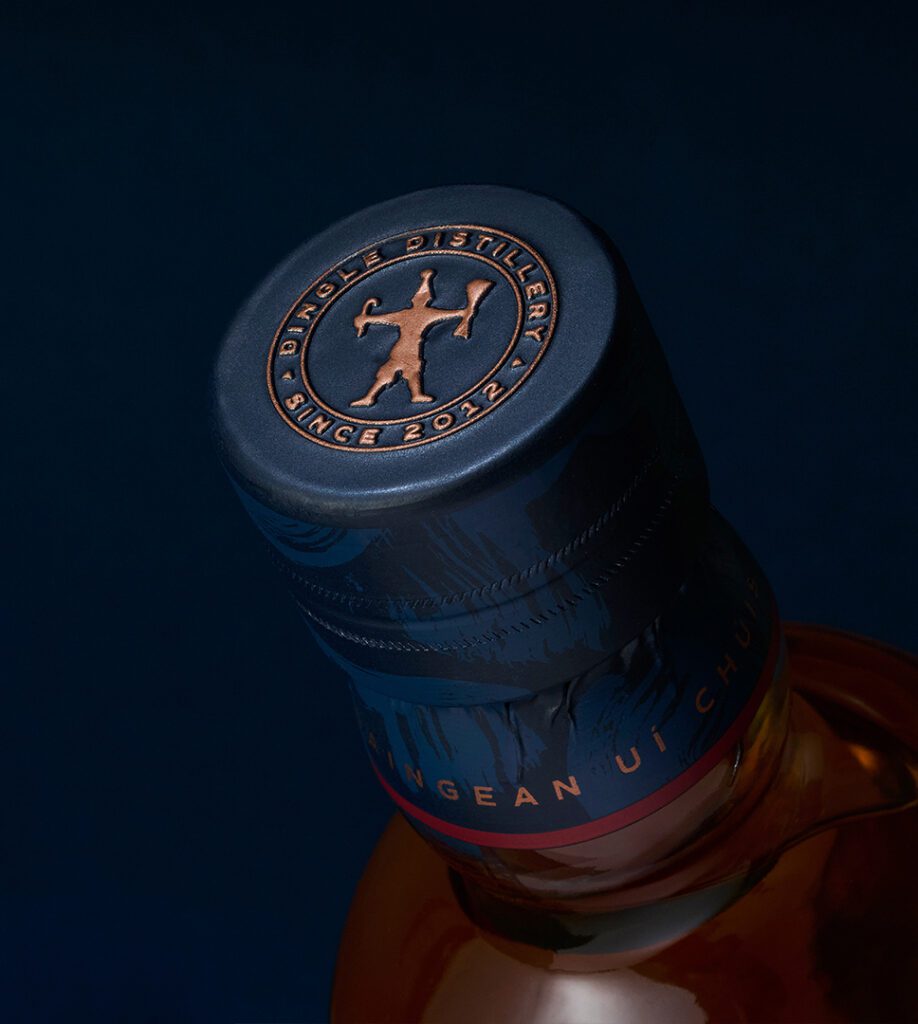
This essence is best expressed through its unique ‘Wren Boy’ icon which symbolises the distillery’s spirit of creativity and connection. This is drawn from the Dingle town’s historic ‘Wren Day’ celebrations, a centuries-old mid-winter celebration of music, storytelling and togetherness that reflects the heart of Dingle’s spirit. A place truly unto itself.
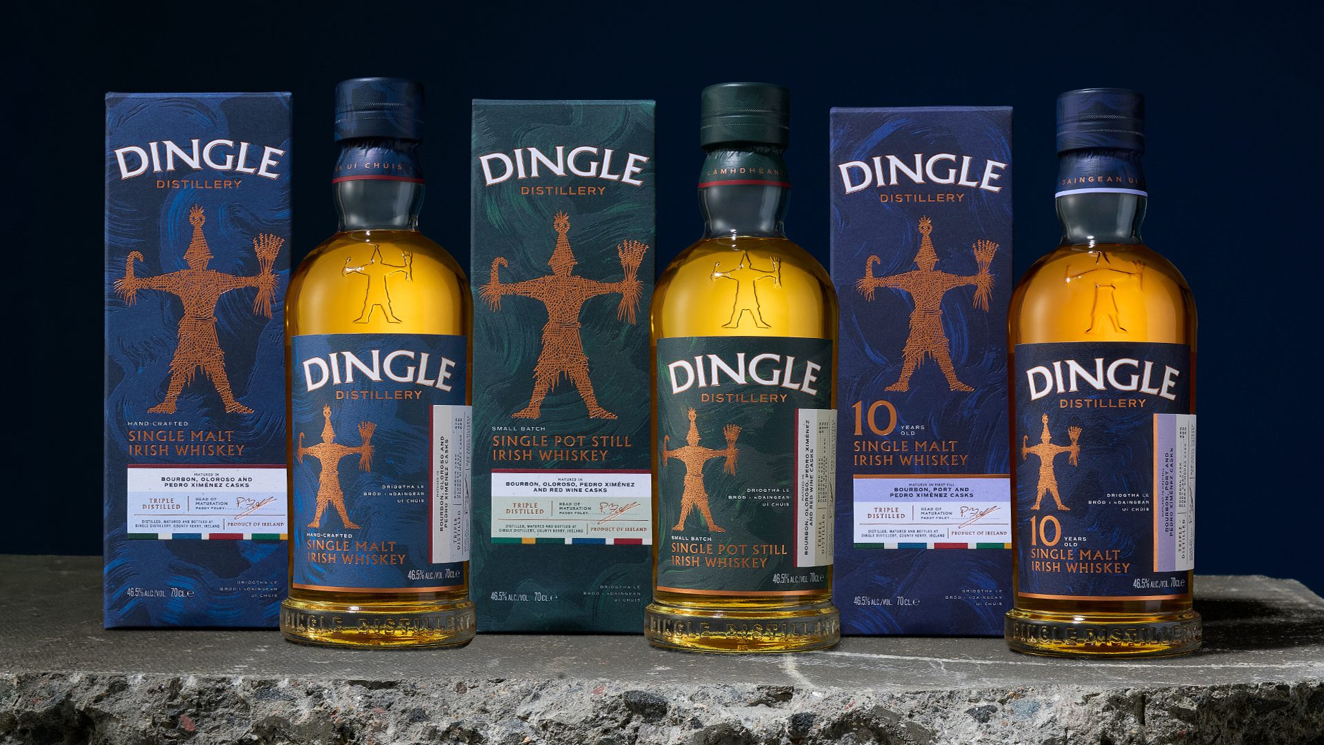
We were briefed to capture this unique set of influences and elevate the design of the entire whiskey range in order to set them up for the future with a larger core product range ranging from premium to super-premium.

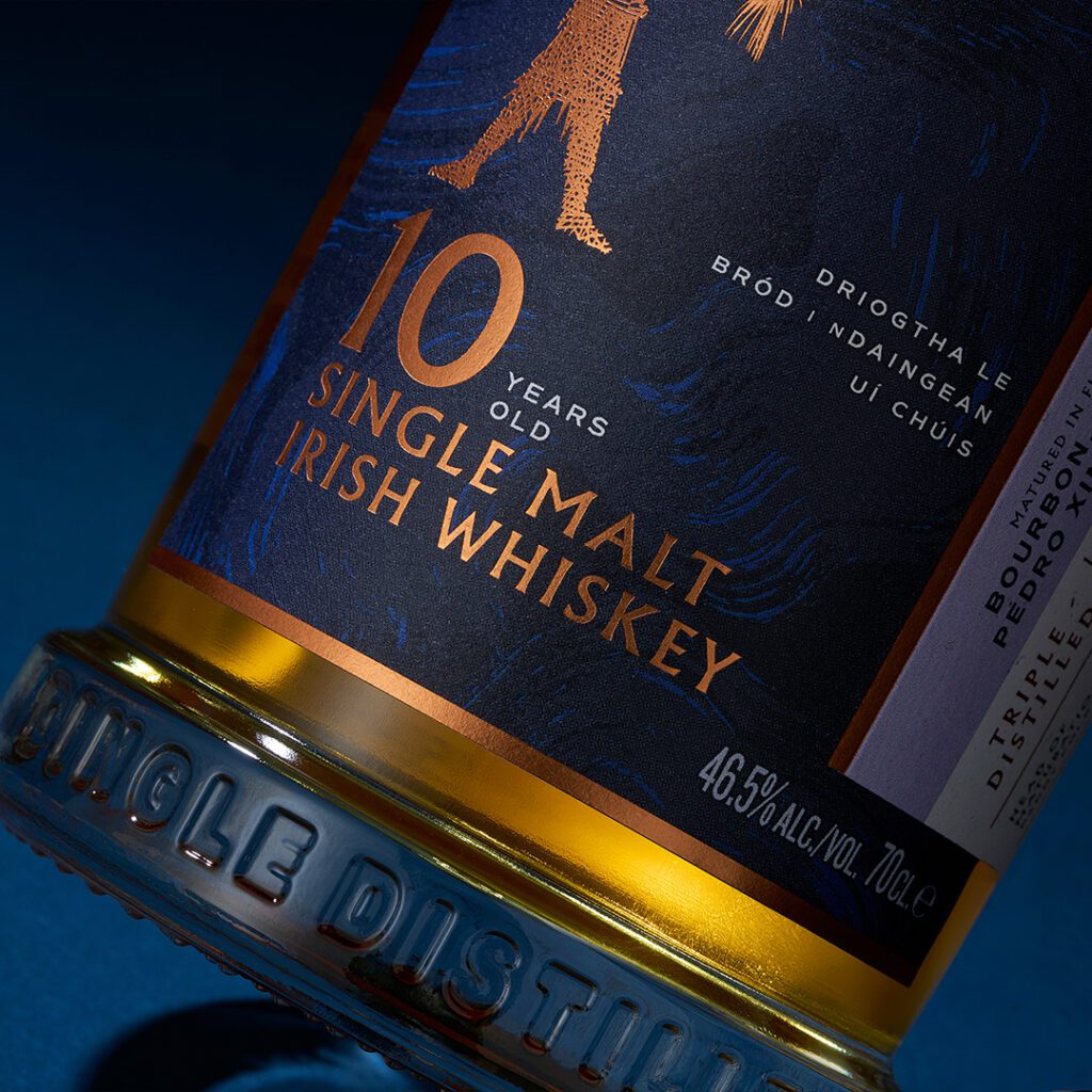
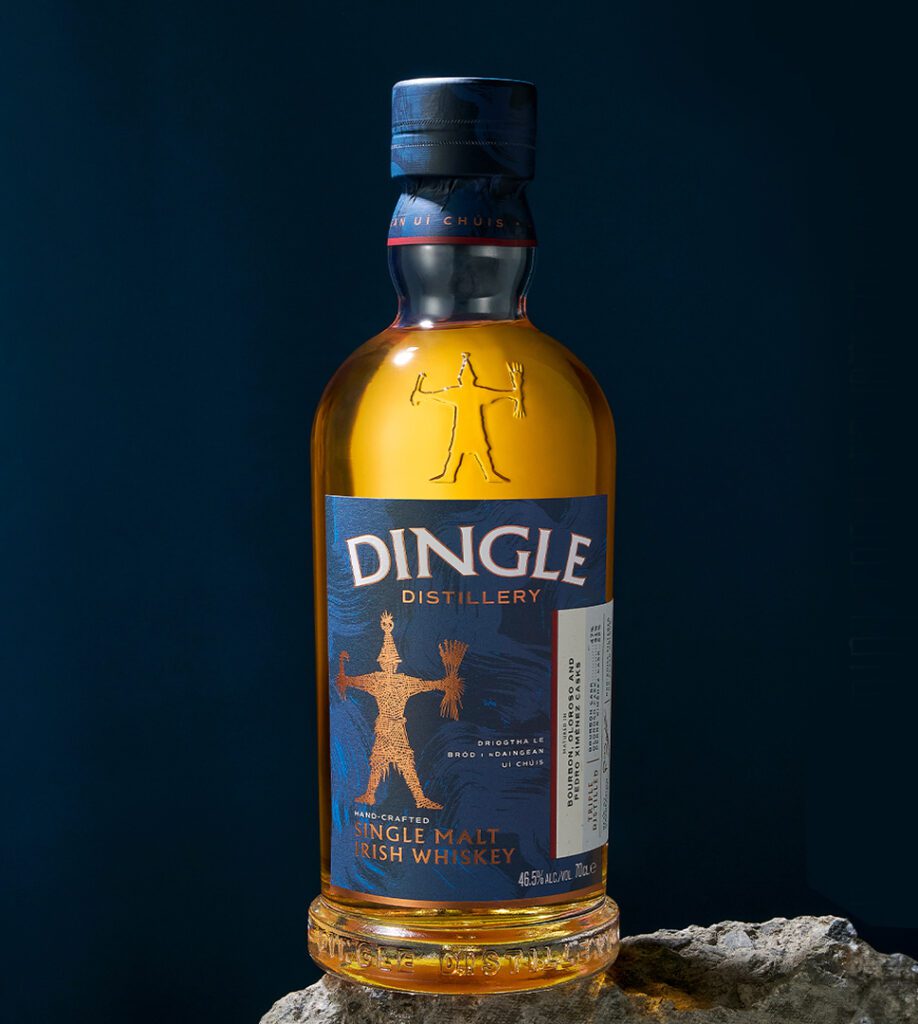
To achieve this intent, we carried out a considered rework of the brand iconic ‘Wren Boy’ logo and redrew the Dingle logotype. Exploration for a new bottle was explored but we decided the existing actually work with strength and recognition.
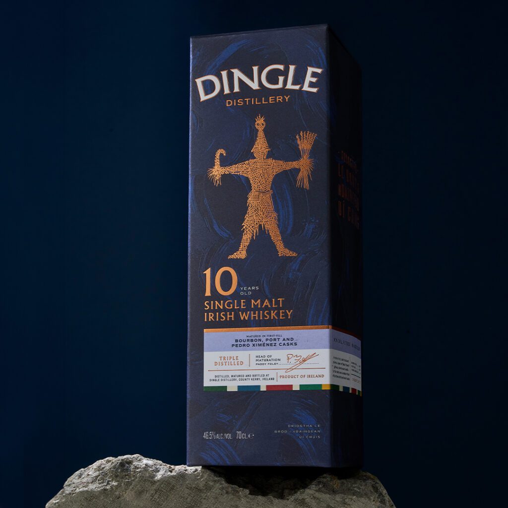
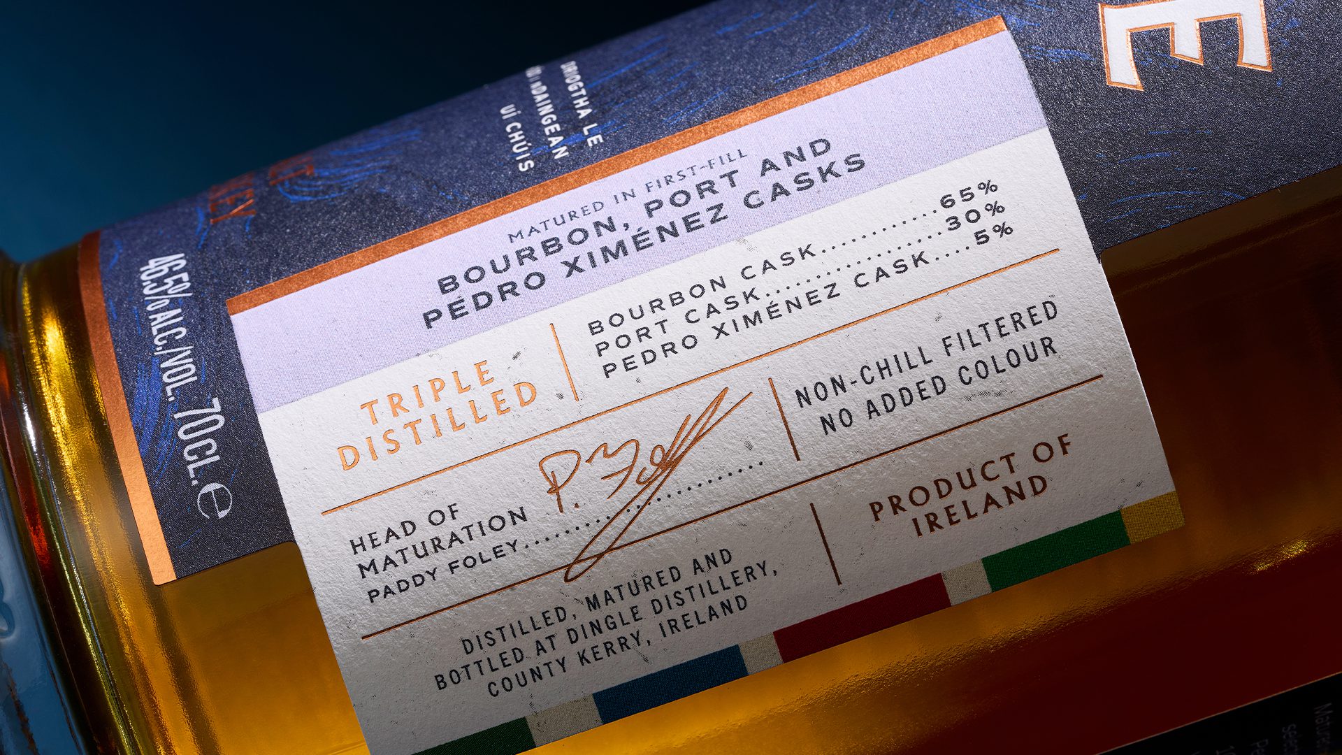
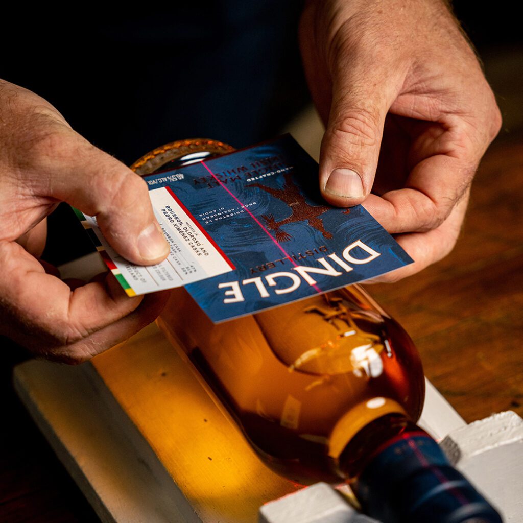
Bottle labels and carton content were reviewed and rearranged to bring a touch of modernity, easier navigation, and to convey key attributes. We also decided on a revised colour palette and to add layers of texture that reflect the locations rugged nature but also aid ranging, Irish Whiskey in blues and Pot Stills in greens.
Other elements were added to raise the premium-ness such as subtle colour dabs that echo the town’s colourful high street and the use of copper foil over gold to reflect stills.
The final structural change was to drop secondary tubes for cartons and add a rigid box display for higher end limited edition and Single Cask releases.
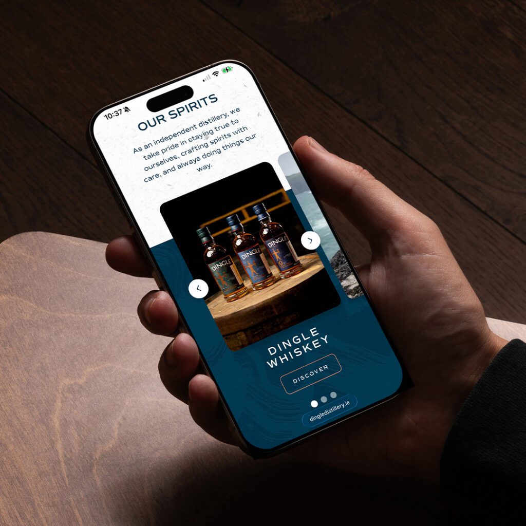
We were also commissioned to review and redesign Dingle Distillery’s website. The objective was to translate the same sense of craft, heritage, and clarity found in the physical brand into a digital experience that felt equally considered.
Our approach focused on establishing a clear and intuitive UX framework, simplifying navigation, and prioritising the storytelling at the heart of the distillery. Crucially, the platform was designed with flexibility in mind. The navigation system and content architecture provide a scalable foundation that can evolve as the brand grows allowing new releases, and stories, to be integrated seamlessly without disrupting the user journey. The result is a digital presence that reflects the distillery’s craft while supporting its future development.
Brand Home Experiential / Packaging Design / Website Design
Brand Creation / Brand Home Experiential / Packaging Design