Whisky In Good Hands - The GlenAllachie
The GlenAllachie set out to modernise, premiumise and refine the brand to bring the packaging in line with the quality inside the bottle. With an acceleration in the demand for The GlenAllachie worldwide, the transformation was necessary to elevate the brand credibility and strengthen its visual appeal on a global scale.
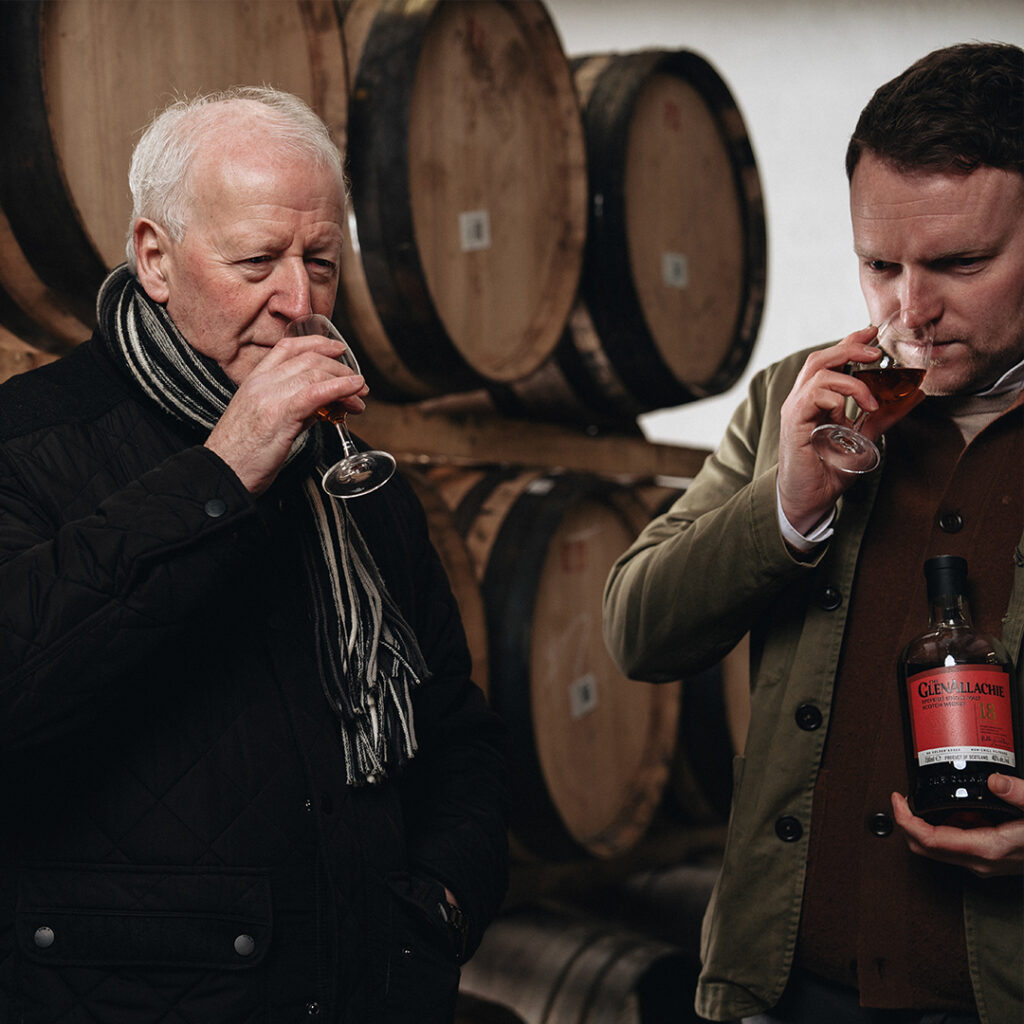
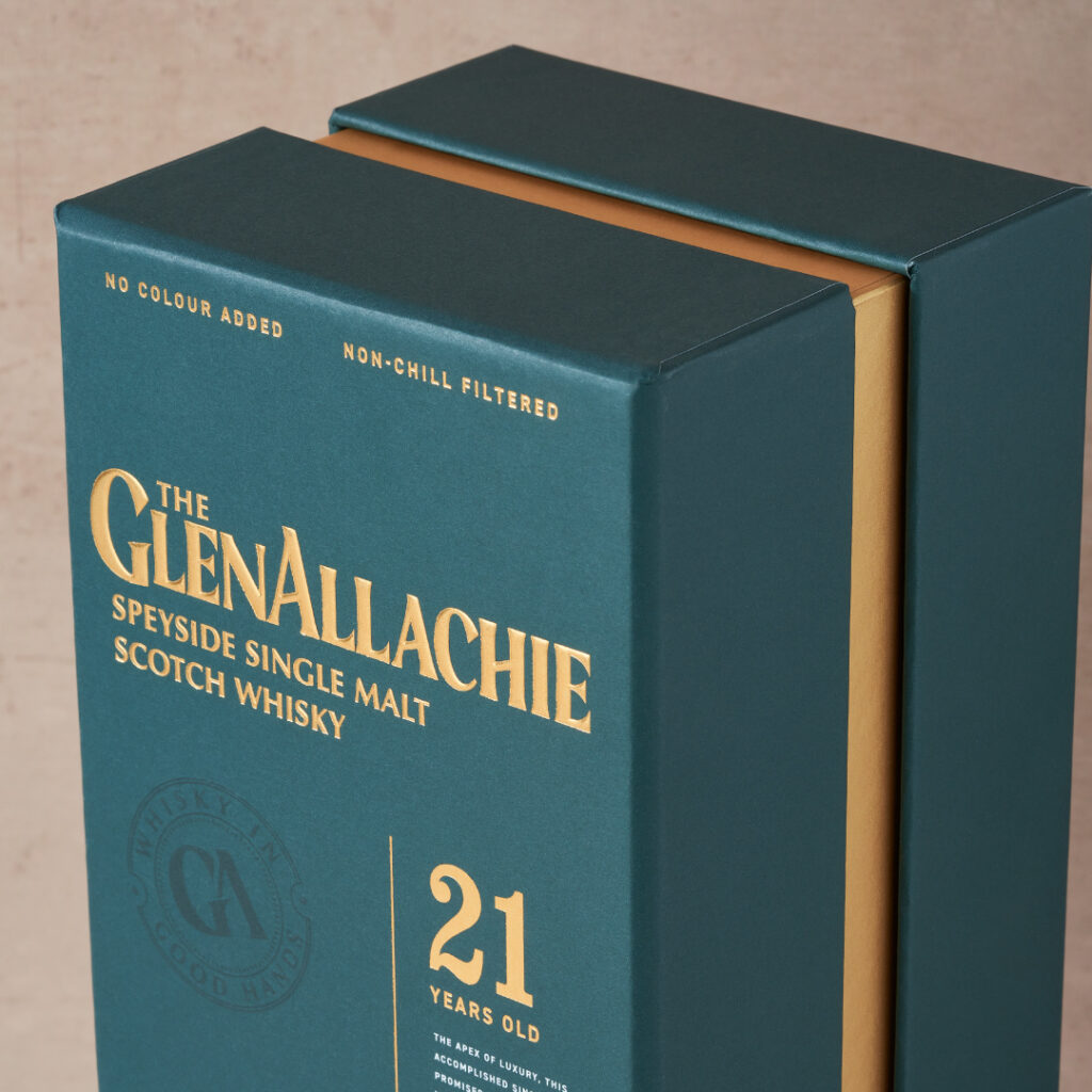
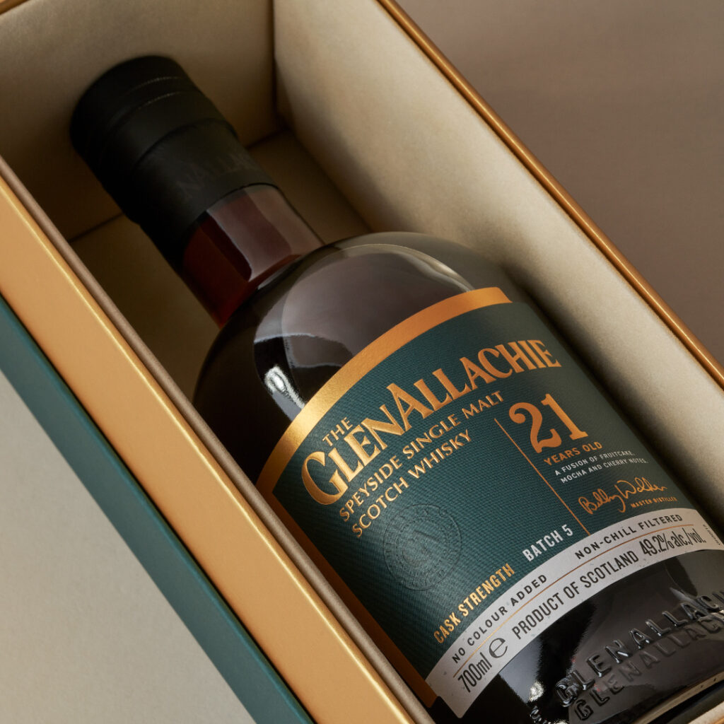
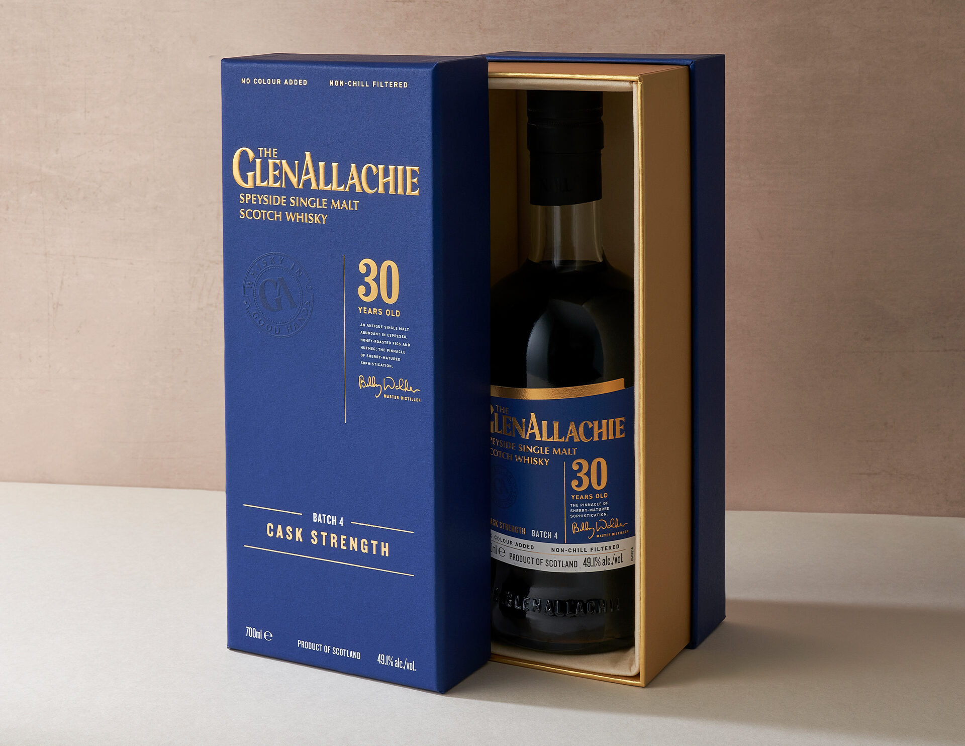
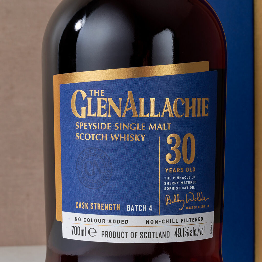
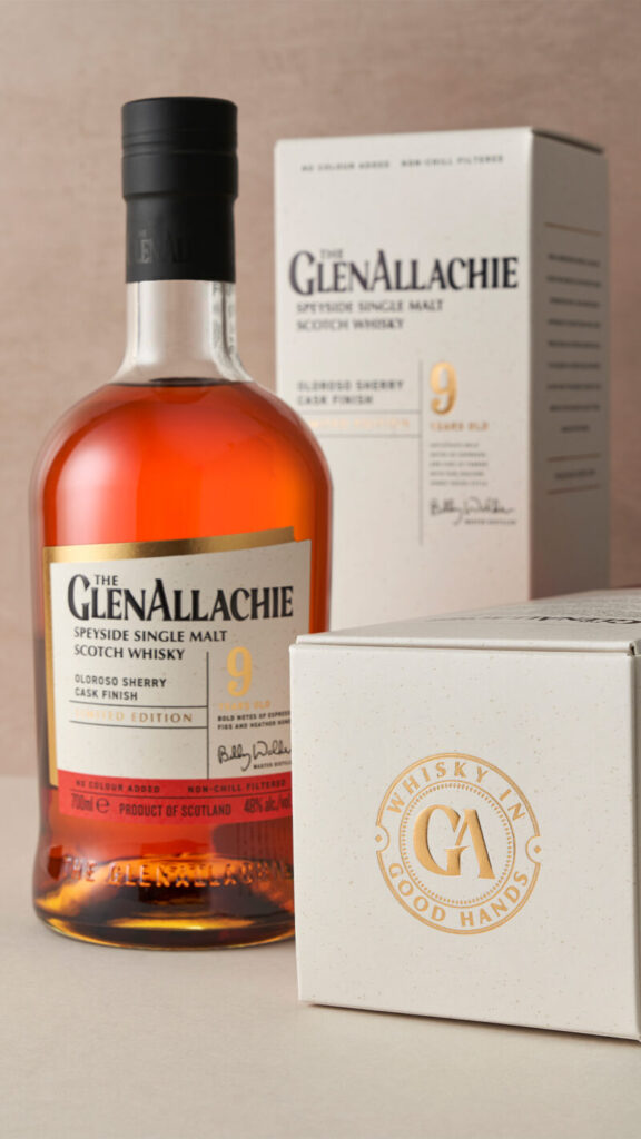
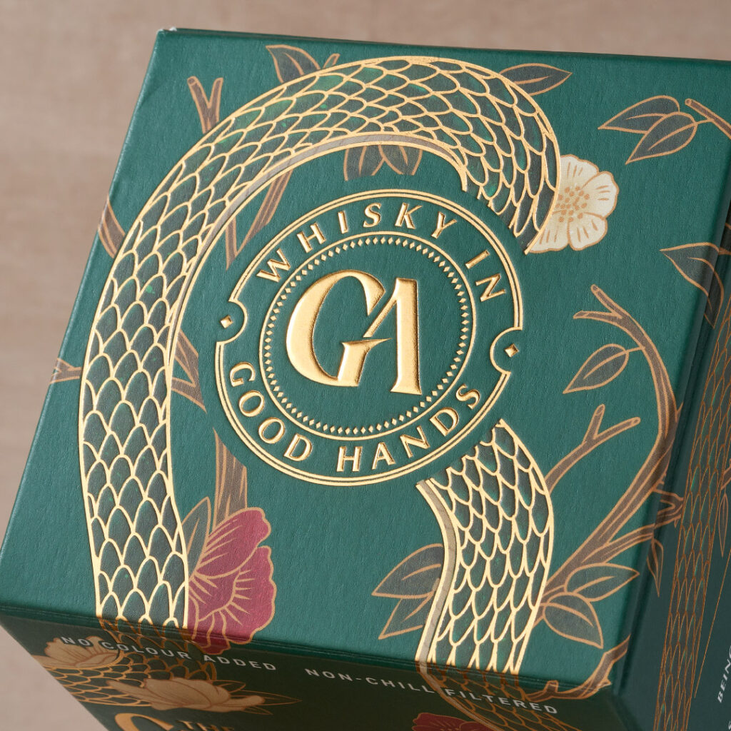
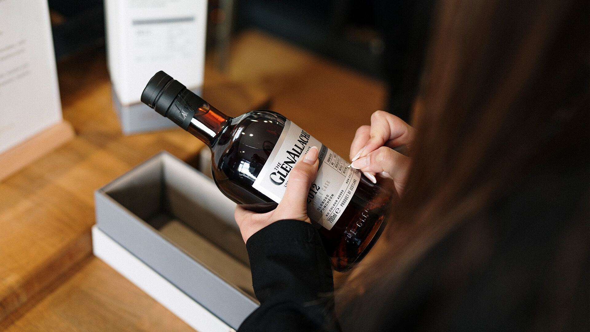
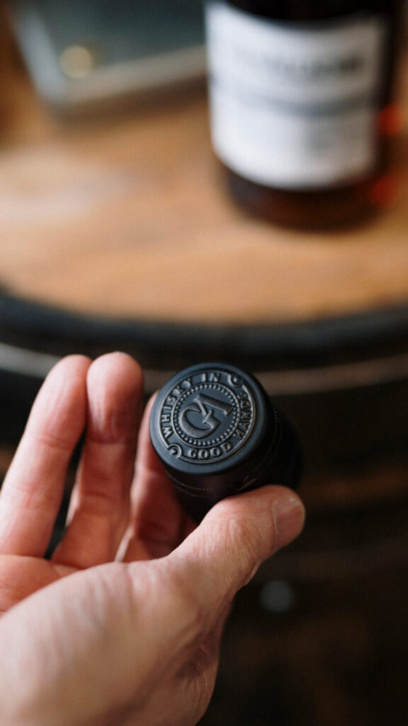
Our brief was very much to approach this as an evolution of the exisiting brand, not a full overhaul, and to respect the quiet confidence this distillery has in itself. Our solution built upon the positioning of ‘Whisky in Good Hands’, focusing on the team including legendary whisky maker of 52 years, Billy Walker. The slanted design elements – inspired by the distillery’s unique shape and the brand’s upward trajectory – adds individuality, and visual appeal to the pack, while the double label was inspired by the two sides of the brands thinking – logic meets instinct.

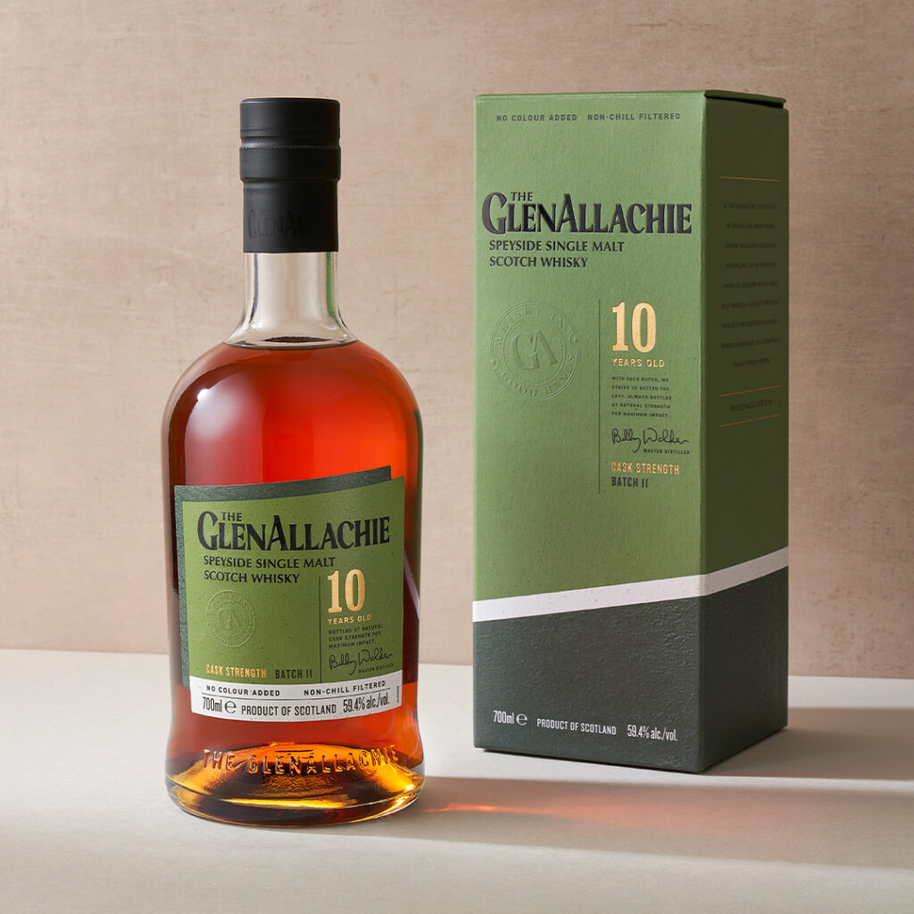
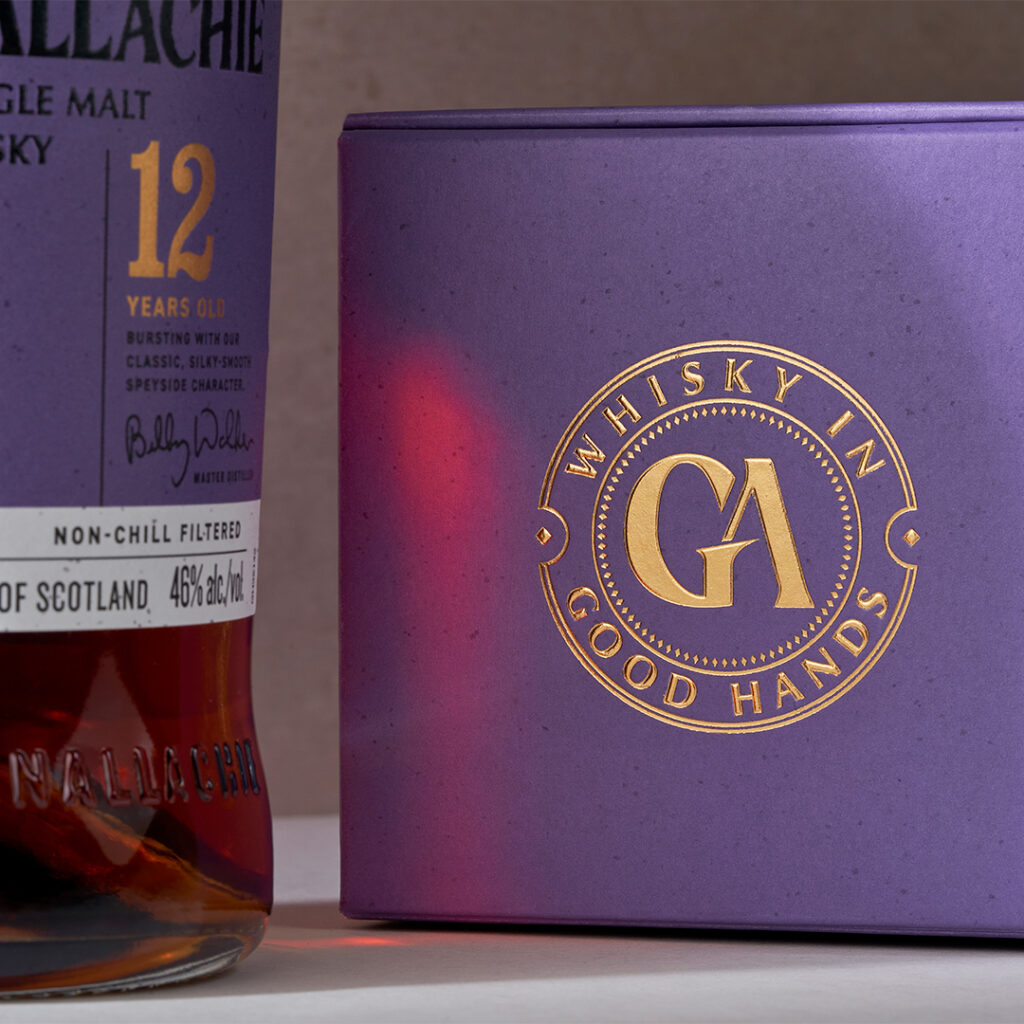
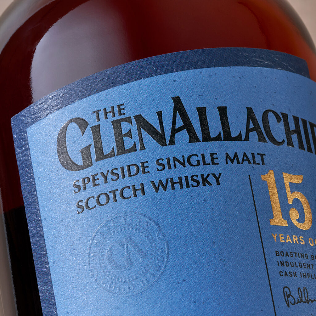
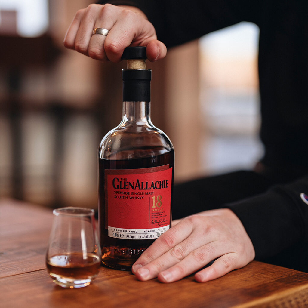
With subtle touches such as the stone texture embossing on both the label and the carton
(a nod to the brands previous positioning of ‘Valley of the Rocks’) and colour coding
provides a connection for The GlenAllachie’s loyal customer base to the previous range look and feel.
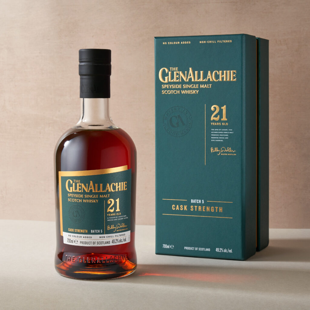
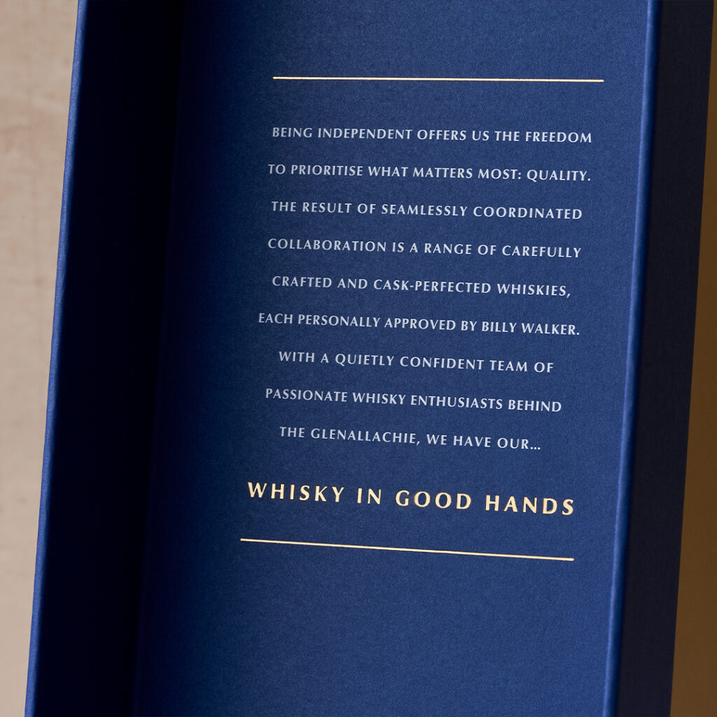
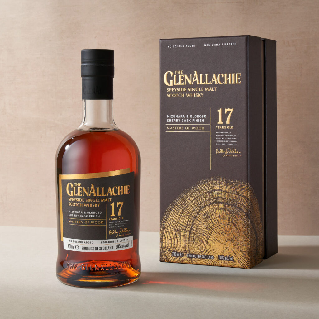
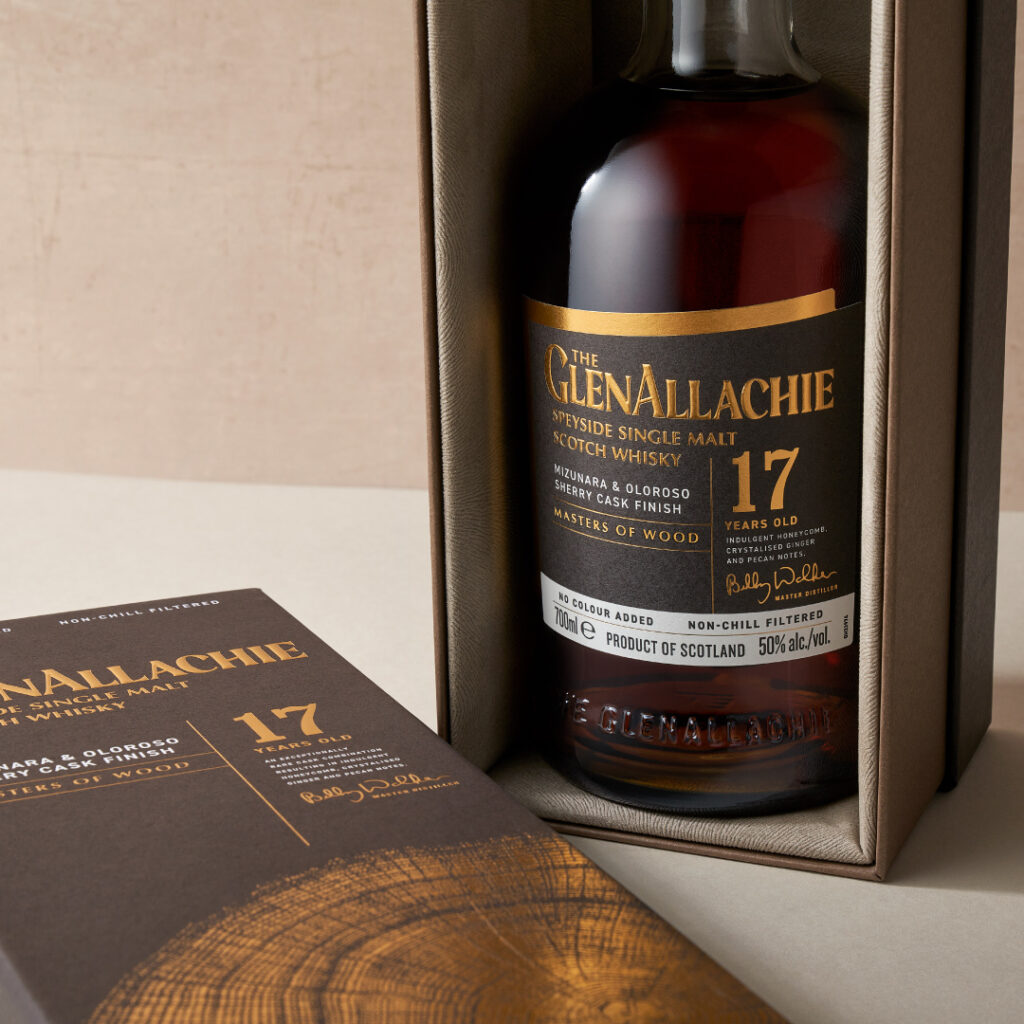
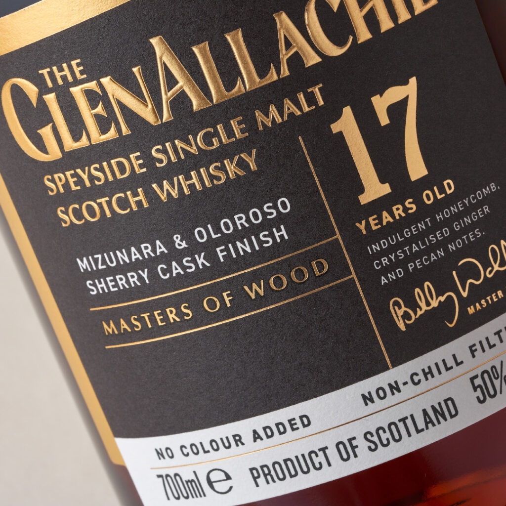
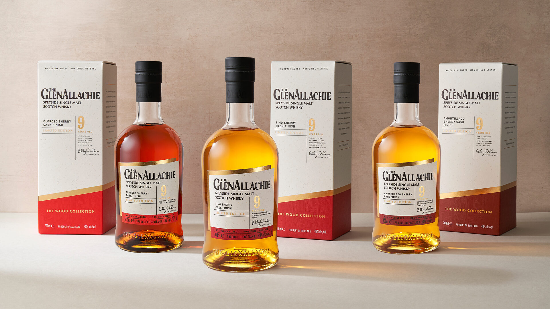
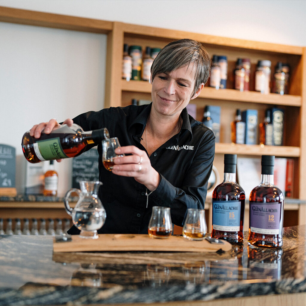
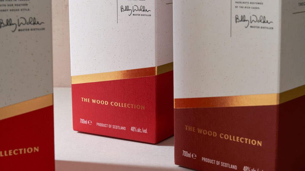
The Wood Collection
As a pioneer in wood finishing, Master Distiller Billy Walker spends endless hours carefully analysing and monitoring various casks slowly maturing in their 16 on site warehouses. Once he determines that the spirit has met the perfect balance between wood and distillery influence, Billy proudly bottles in The Wood Collection.
Single Cask
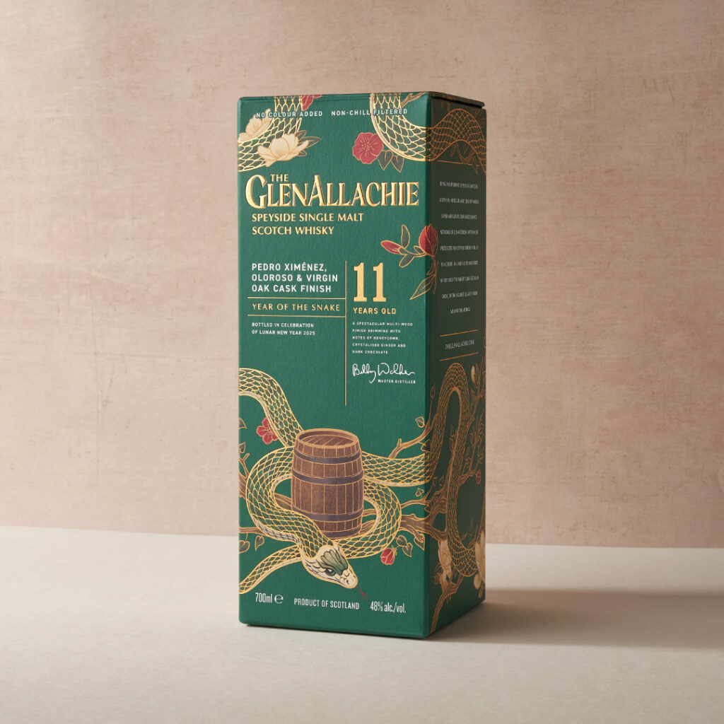
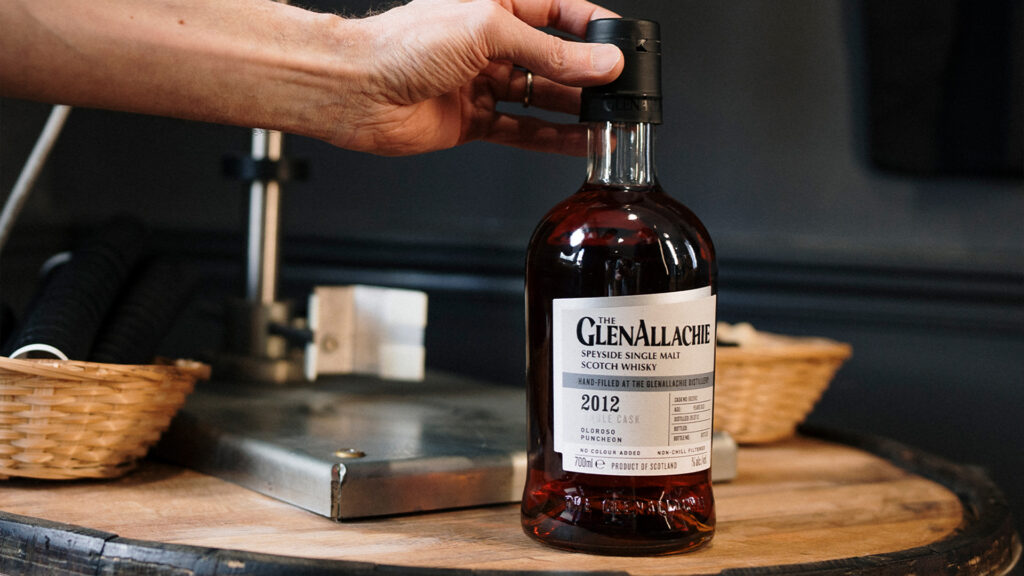
Along with the core and limited ranges, the team is foever stumbling across hidden gems in their warehouses. These unique whiskies merit being showcased individually. Our design reflects the premium nature of these bottles, while allowing for the team to easily update the packaging whenever these unique whiskies are found.
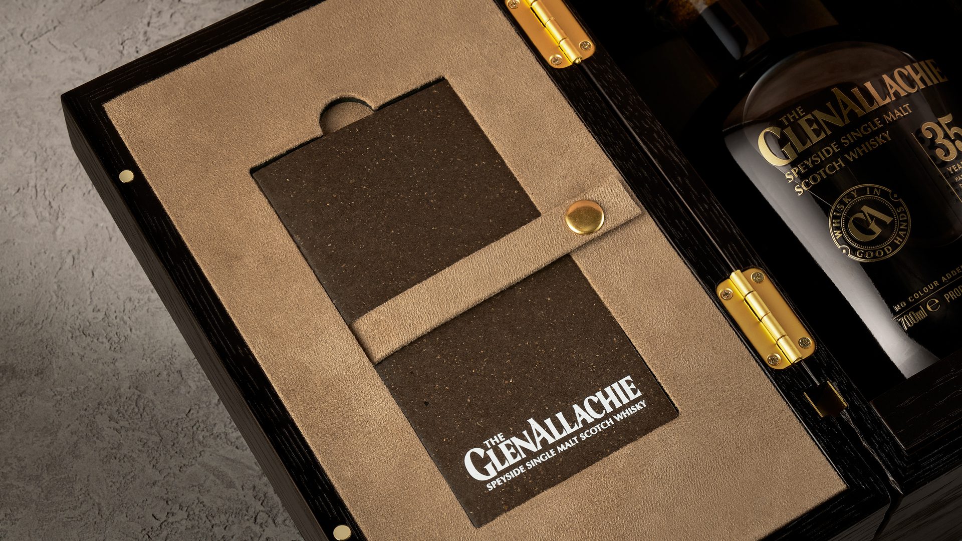
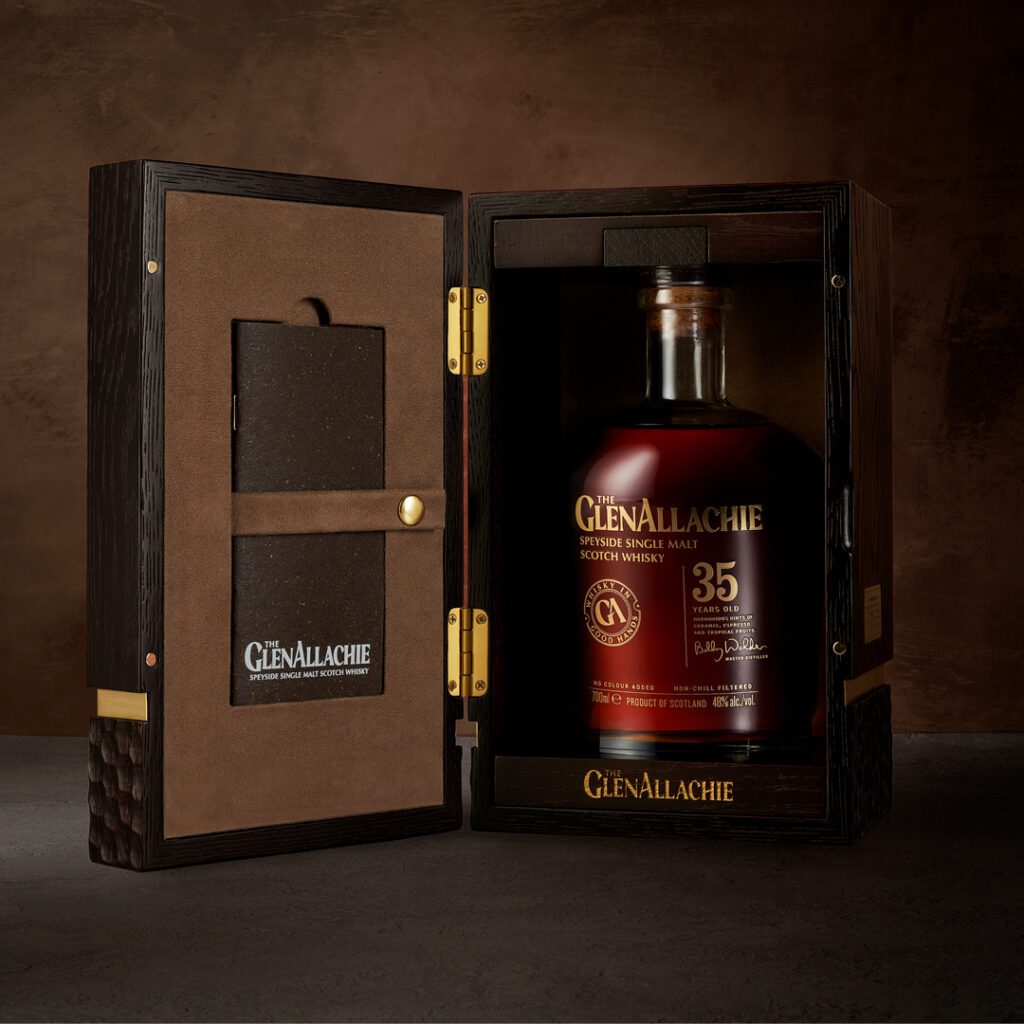
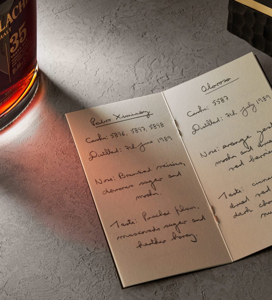
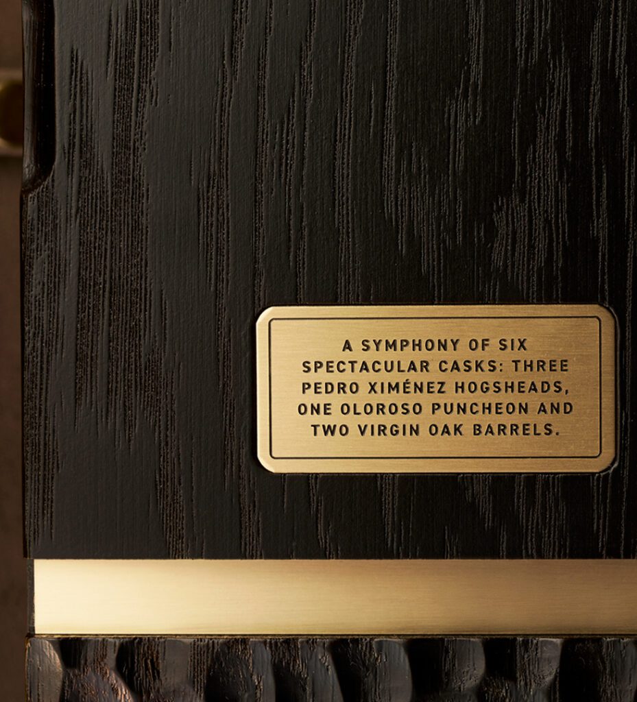
The GlenAllachie 35-year-old is their oldest core release to date. Taking the essence of the core brand, this elevated design included a lavish hand-carved oak box and a hand-written notebook from Billy Walker, the Master Distiller, to give a personal insight into his process which added an emotive surprise for the consumers.
Limited Edition / Packaging Design
Brand Refresh / Packaging Design / Website Design
