Increasing brand visibility
in a competitive market
– Speyburn Single Malt Scotch whisky
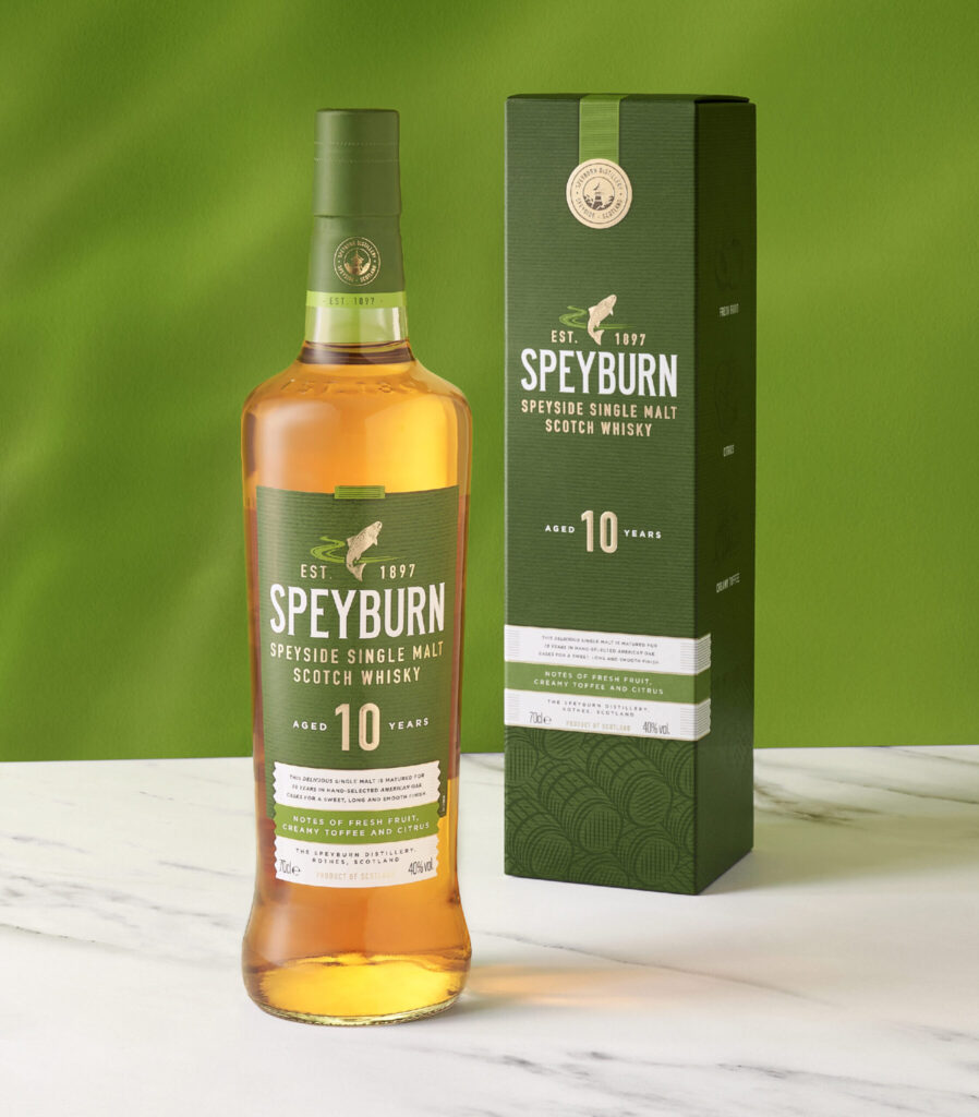
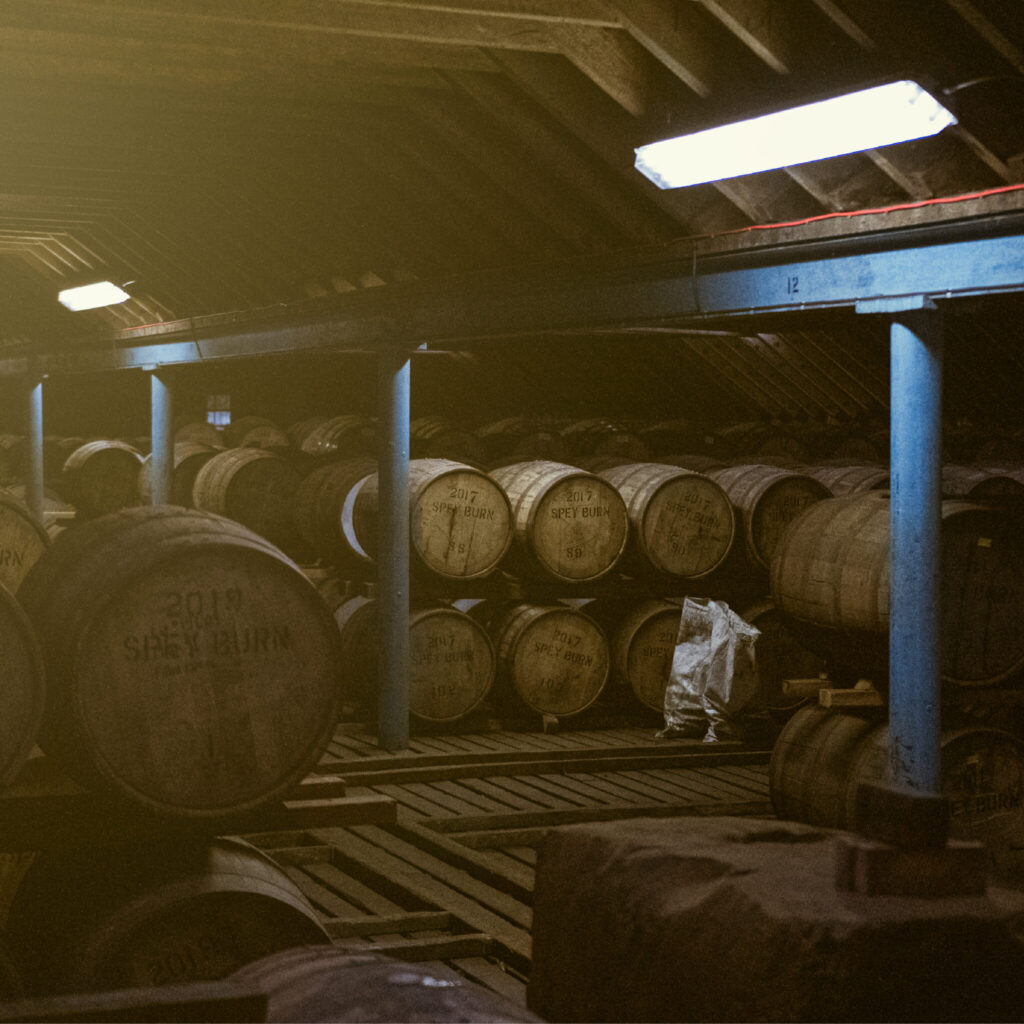
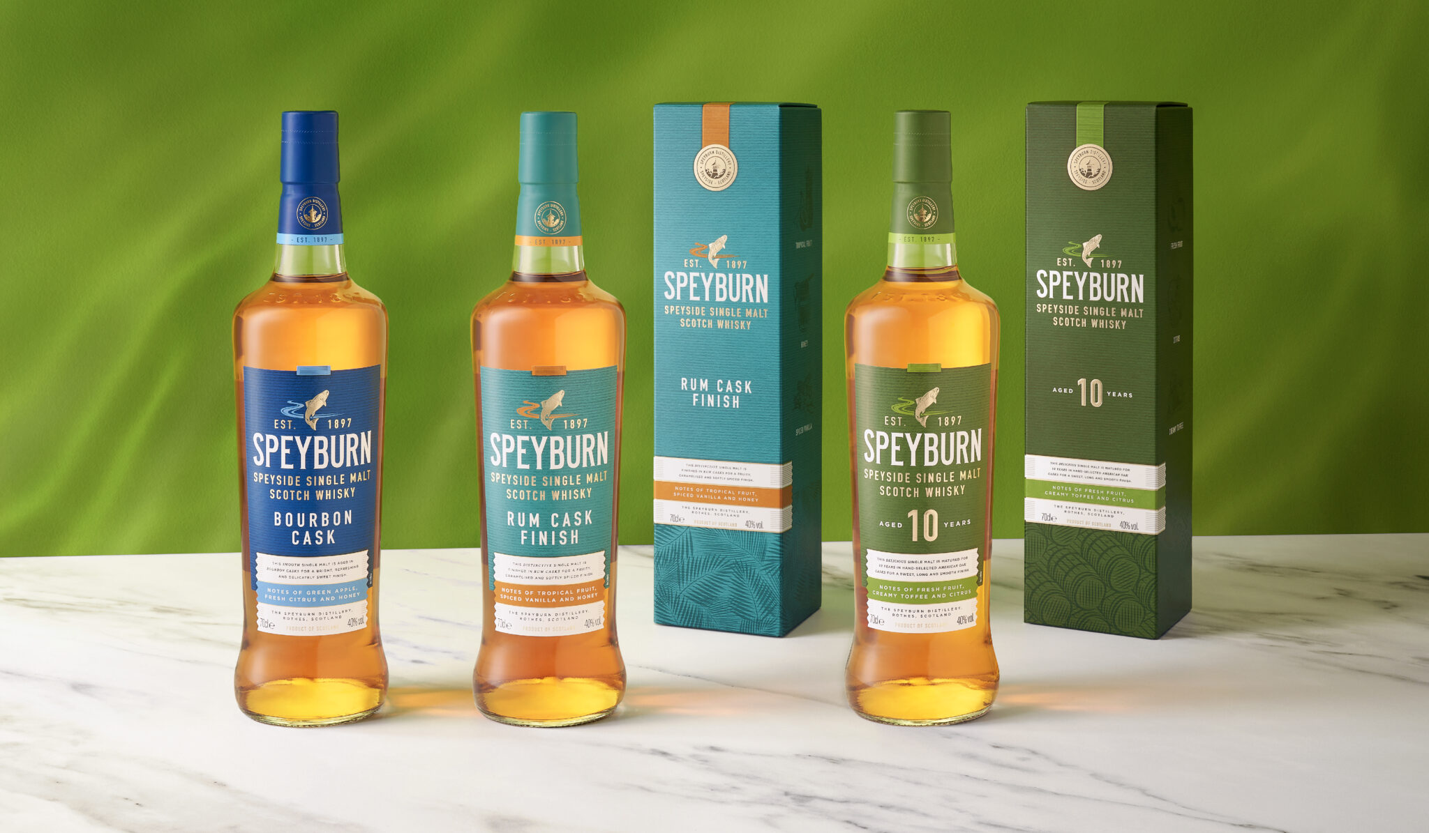
Speyburn has undergone a complete brand refresh with the core domestic range being the first step in this, marking a new chapter for the iconic Speyside distillery.
Tasked with evolving and refining the core domestic range we set out to address specific retailer feedback and improve visibility and brand stand out at the point of purchase.
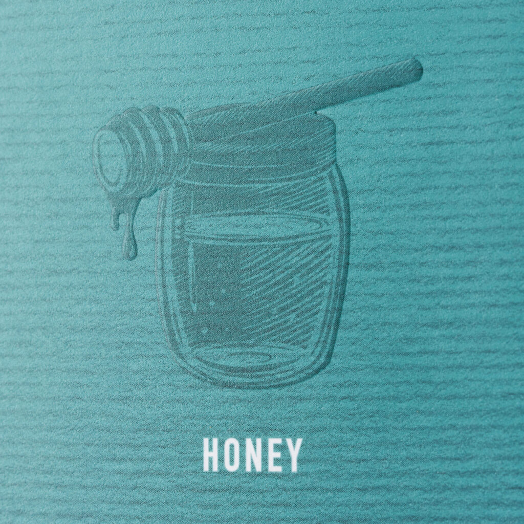
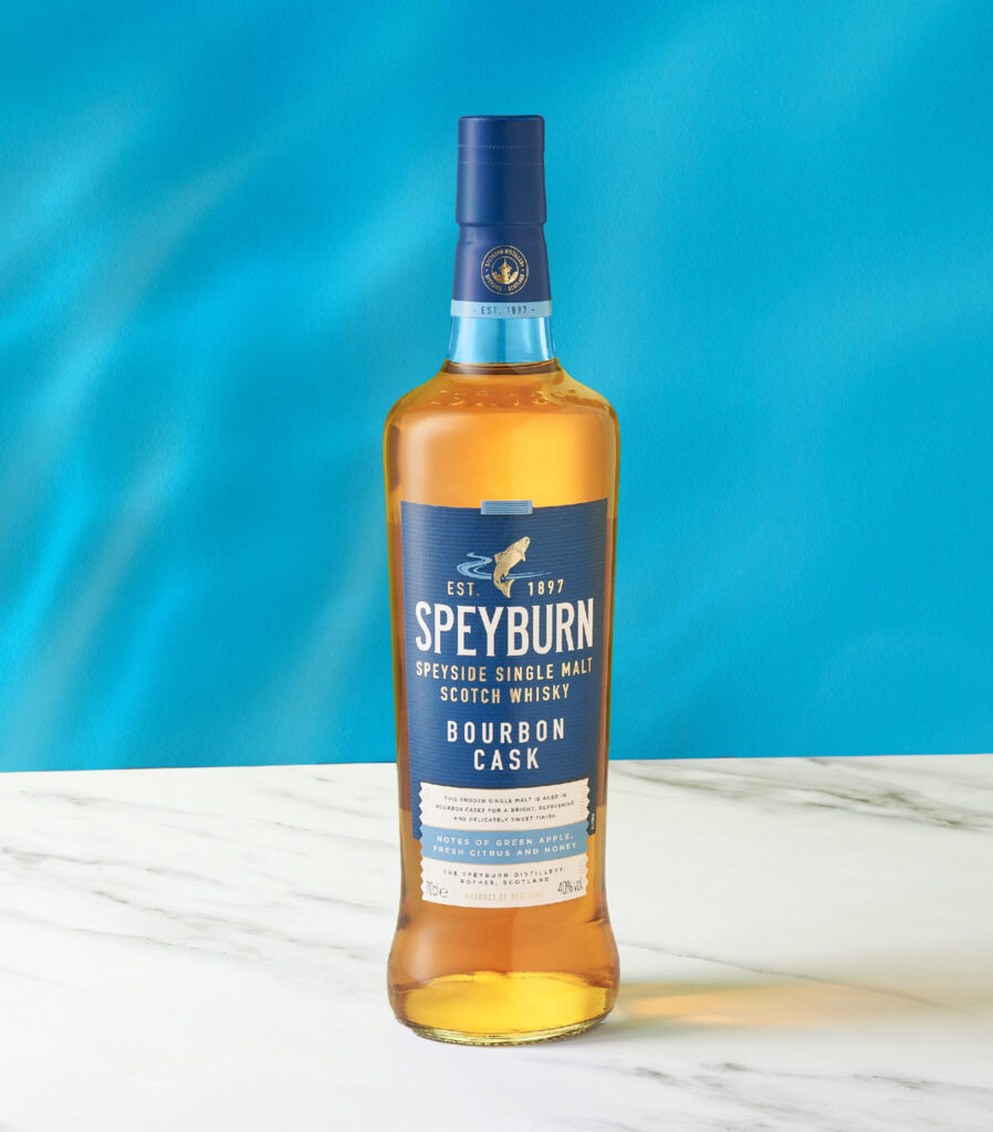
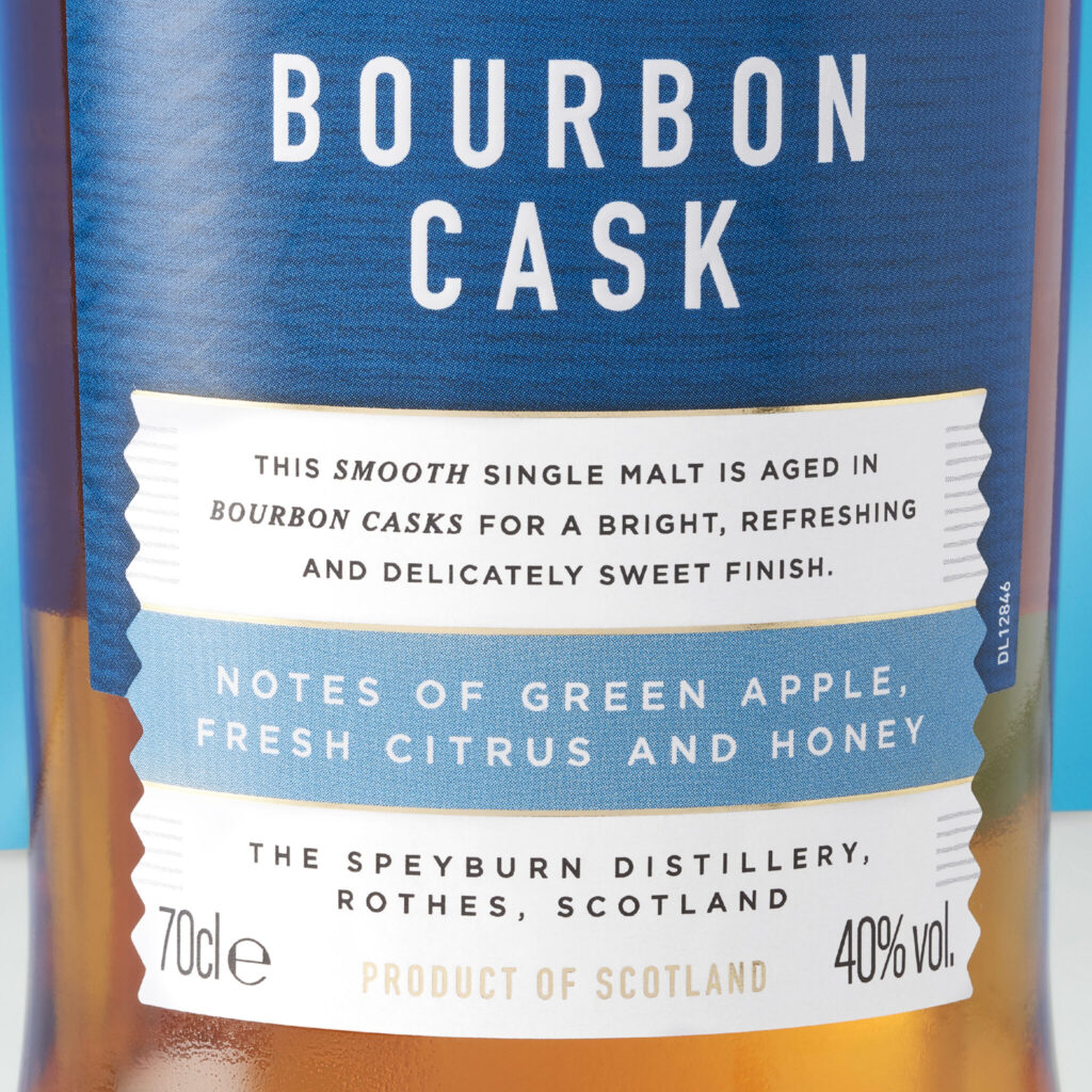
Informed by consumer insight, our design solution utilises a ‘no frills’ look and feel, highlighting the flavour notes of each product and increasing the premium production feel through use of texture, foil and embossing.
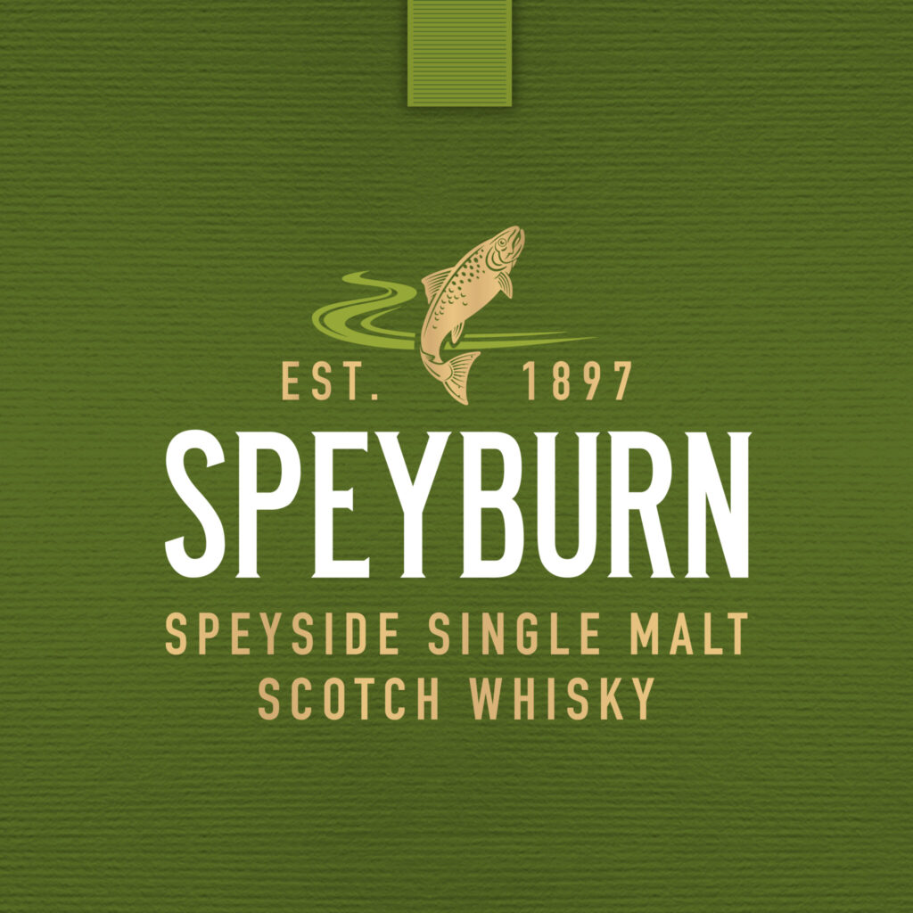
A combination of a bright, eye-catching colour palette, more prominent branding and graphics conveying key flavour attributes, and illustrations at the bottom of the secondary packaging capture the cask finish of each expression along with details of the cask finish story – all of which allows for greater shelf visibility and is welcomed by those new to the world of whisky and seasoned whisky enthusiasts alike.
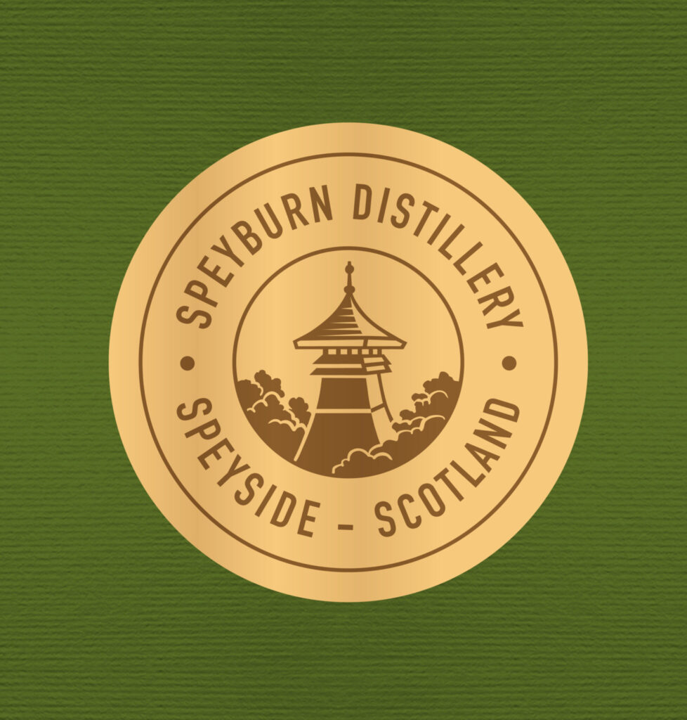
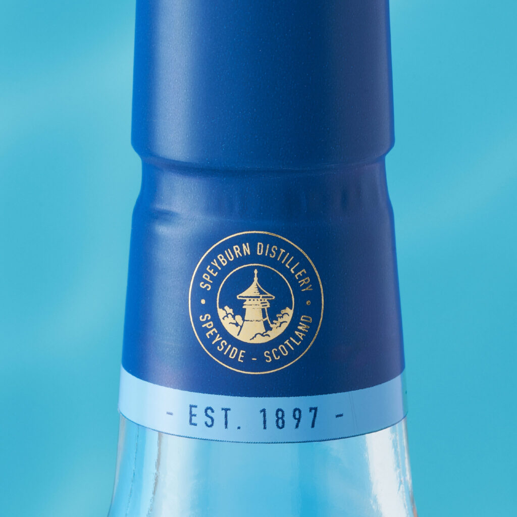
We also increased the prominence of key brand assets of the distillery’s pagoda-shaped roof and its1897 founded date in a nod to the brand’s historic legacy.
The whisky category Speyburn targets is very competitive and has seen a visual transition from more traditional cues and signals into more contemporary design plays to attract a less experienced consumer. The new creative takes the core brand DNA and represents it with the right balance of accessibility, provenance and premium cues to drive appeal and stand out.
Speyburn’s complete collection will carry the striking new design including a new expression to the range and will be rolled out across higher-aged expressions later this year – watch this space!