Greenhook Ginsmiths
Working with brand owner Steve DeAngelo, we created the initial identity and packaging for Greenhook Ginsmiths in 2012. The look and feel was based on the premise that it’s the delicate details that make a world of difference. We captured the subtleties of flavour and the distilling processes that are unique to Greenhook.


This bold and impactful look had immediate call-out in premium bars and won Gold at the International Packaging Design Pentawards.
The brand has gone from strength to strength and in 2020 we worked together once again to refresh their packaging.
A key ask was to create a more unique and premium look, creating even more cut through in both a bar environment and the increasily busy world of direct to consumer online sales.


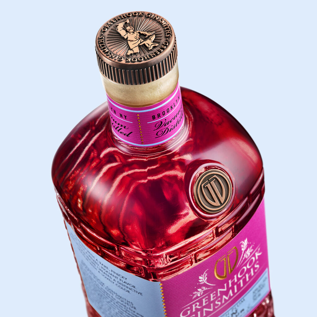
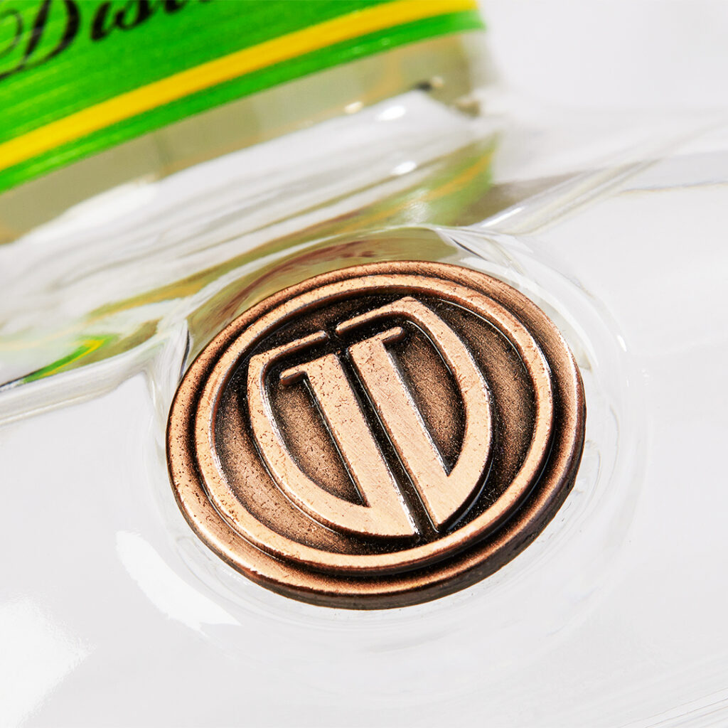
We created a bespoke bottle design and amplified the recognised visual strengths of the existing Greenhook brand identity. With clever use of brand colours, paper selection, badging and production techniques we delivered a new premium feel to the brand.
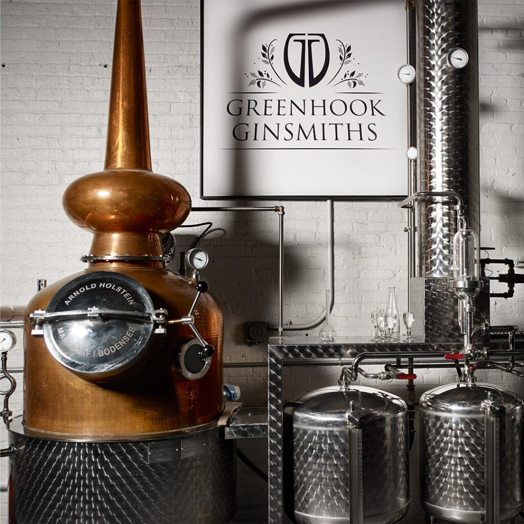
The bottle design echoes the brickwork seen within the distillery home and creates distinctiveness in a market that is now much busier than when the brand first launched.


Limited Edition / Packaging Design
Brand Refresh / Packaging Design / Website Design
