
Let The Grain Reign – Blackwater Distillery
Following the successful launch of the Dirtgrain Manifesto Release, Blackwater Distillery are making its mark on the whisky industry with the launch of a core range of single barrel releases.
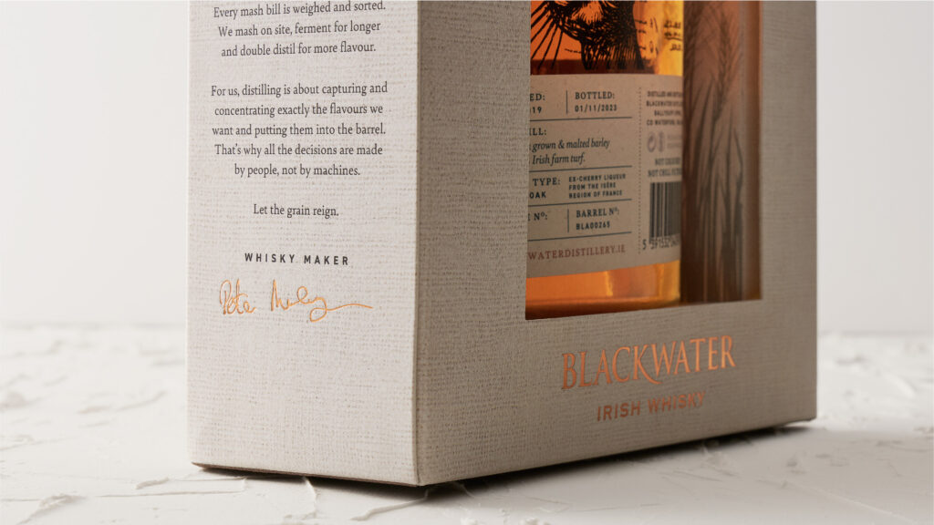
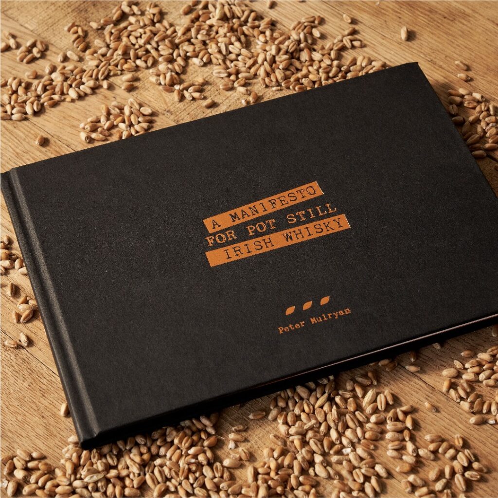
Peter Mulryan and the Blackwater Distillery team’s attitude is one of passion and their story captures over 30 years of research into the history and origins of Irish Whisky. They champion mash bill transparency and creativity. They know flavour starts in the field and that people make better decisions than machines.
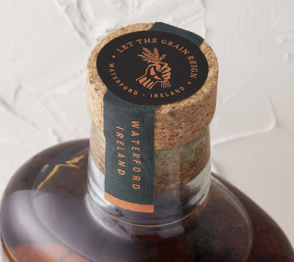
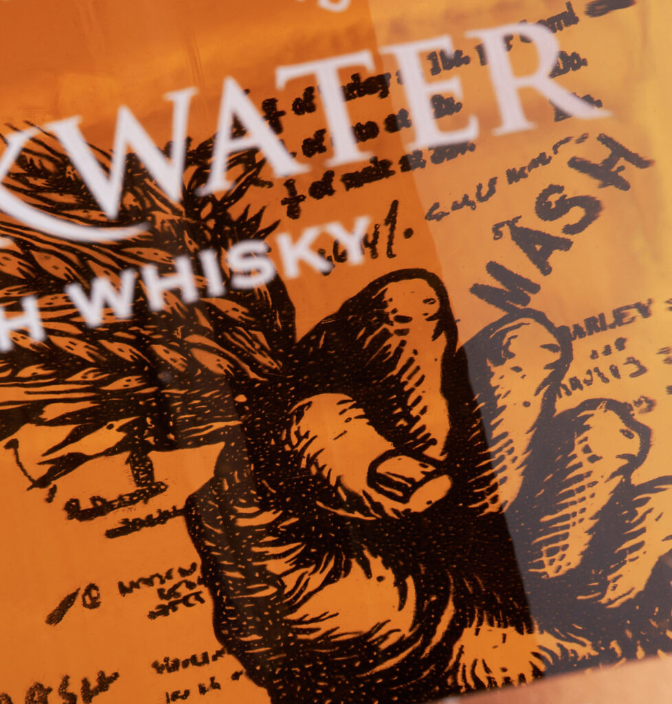
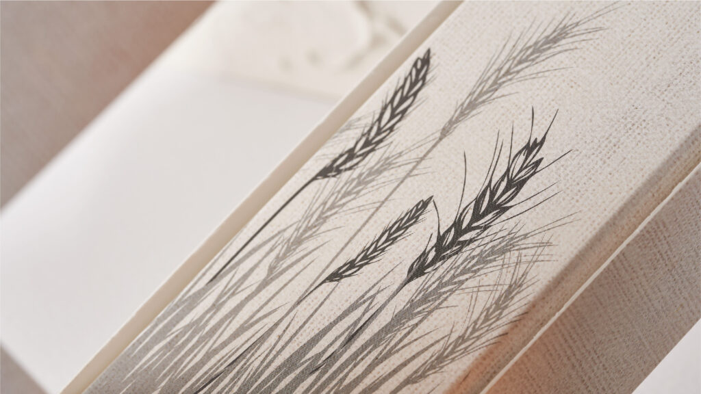
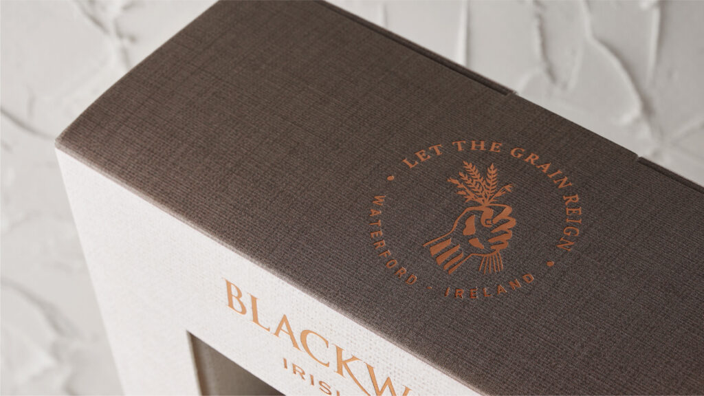
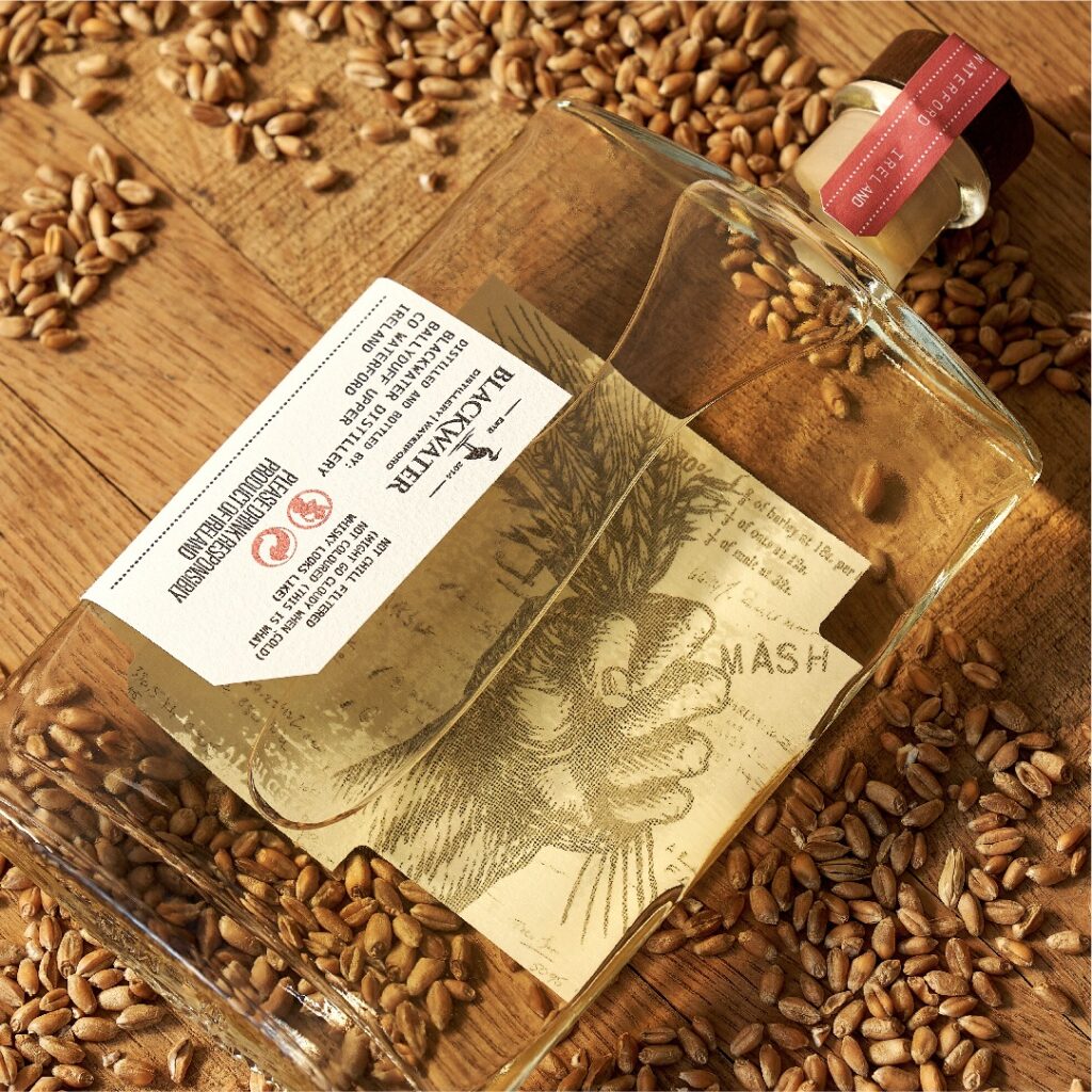
Blackwater Distillery stands against the specifications set out in the Irish Technical File and believes Irish Whisky belongs to us all, not the select few. Their grain is Irish, grown and malted. They required a premium approach for their branding and packaging solution to encapsulate the brand’s storytelling and character. Representing this defiance to the strict regulations, we created a dramatic clenched fist illustration, created in collaboration with Irish illustrator Steve Doogan. The fist holds mixed grains aloft in a powerful and confident ‘rallying’ way. This symbolises the importance of mixed grain in Blackwater’s whisky mash bills and to the flavour profile of the liquid.
For the packaging, we began with a unique, heritage-inspired bottle from Estal Glass. Made with recycled glass, the bottle has a natural flint colour and is topped with a sustainable ‘corkcoal’ stopper.
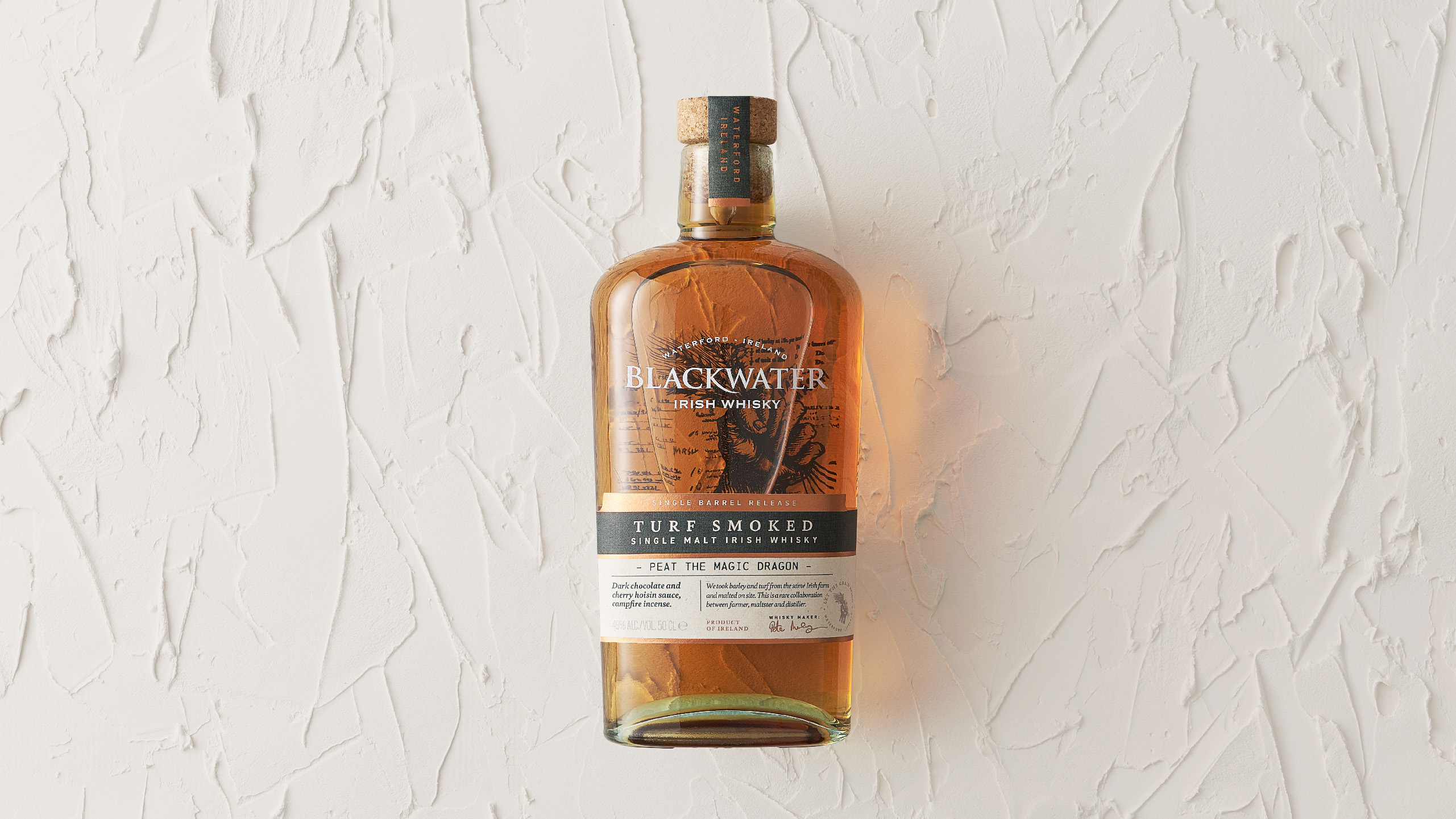
Reverse printed on the back of the bottle, the fist illustration shows through the liquid, capturing the brand’s defiant character within every drop.
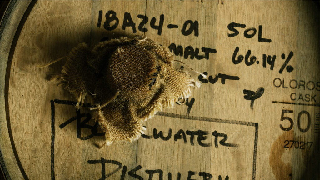
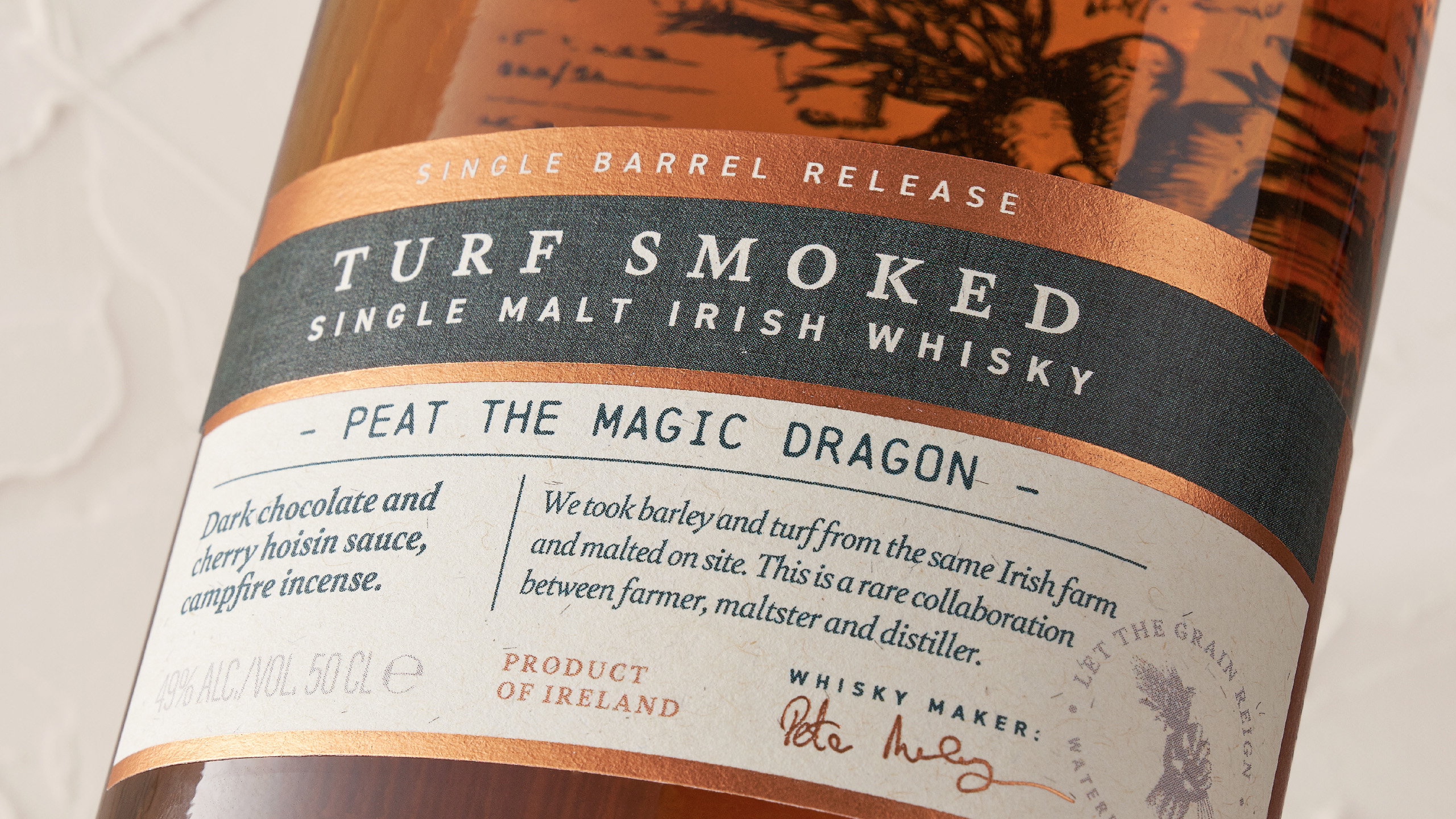
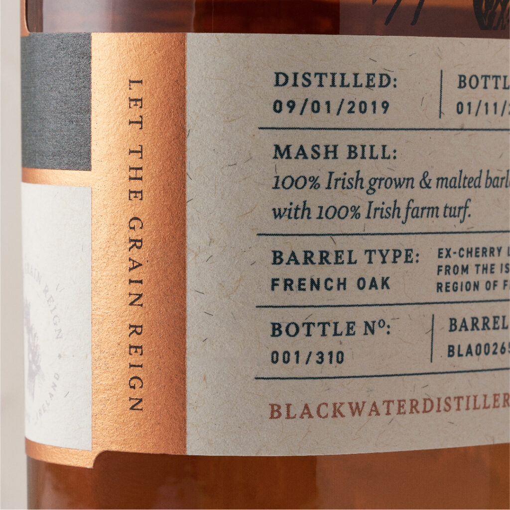
Enveloping the lower third of the bottle, the wrap-around label carries non-traditional flavour and taste profiles, along with the breakdown of the unique mash bills. Blackwater’s unapologetically unique personality is captured within the unusual naming of each release. Namely, ‘Peat the Magic Dragon’, ‘Starburst Spice Bag’ and ‘Planxty Wilcox’.

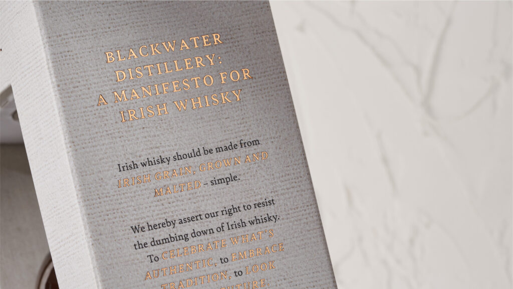
Finally, a secondary box with a frame structure showcases the luxury detailing on the label. Accents of copper foil bring the two elements together and both the brand’s manifesto and a note from Peter are visible on the box side panels.
This is a premium whisky presentation with unique touchpoints and layers of storytelling for a brand that is full of character. The first release sold out within days of launch and the second release is now highly anticipated.
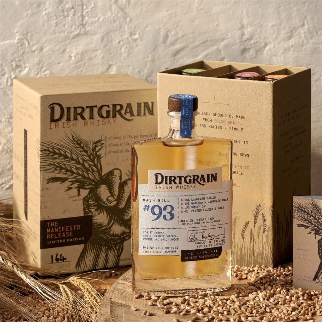
Dirtgrain Manifesto Release – Blackwater Distillery
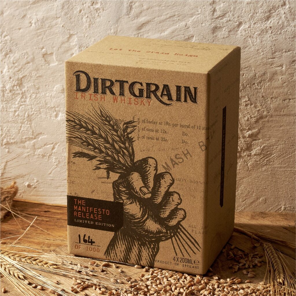
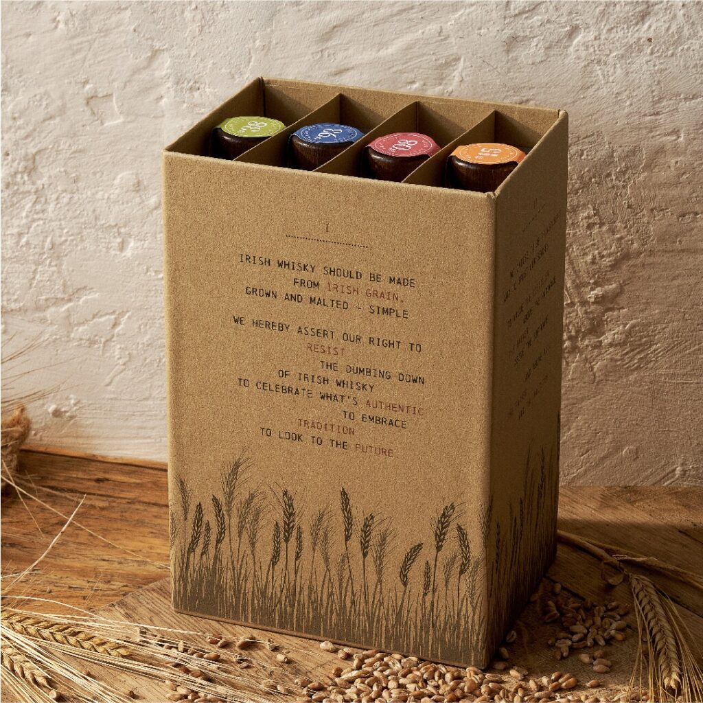
The Manifesto Release is a rebirth of Irish Whisky. A two-part rigid secondary box is home to four 200ml unique flask-shaped bottles. A linocut fist and grain illustration lead the brand iconography, whilst scanned annotations and notes from Peter’s years of research are peppered across the pack exterior.
Our icon created by Irish illustrator Steve Doogan, shows a fist holding the grain aloft, championing the most important component of the whisky.
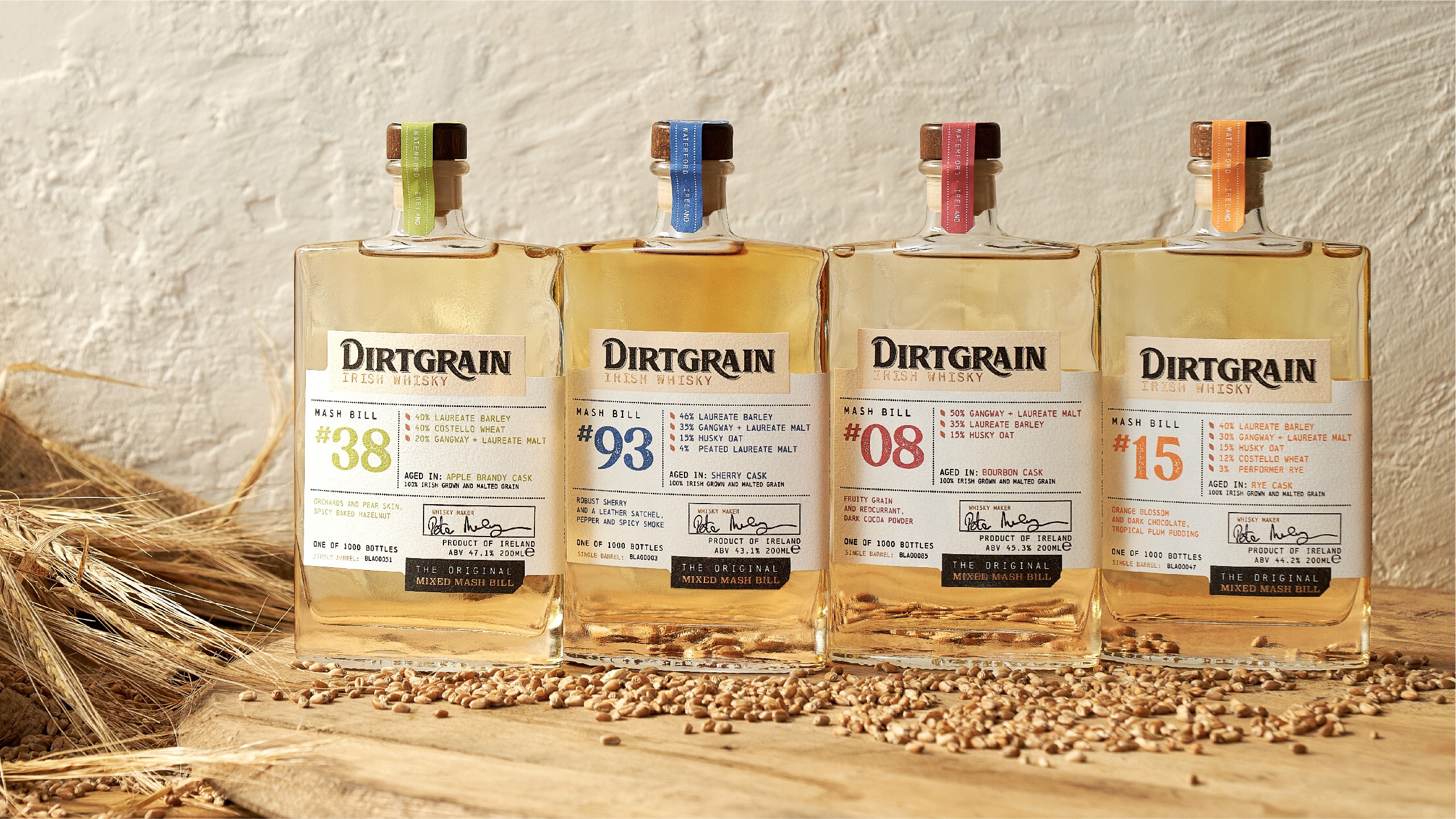
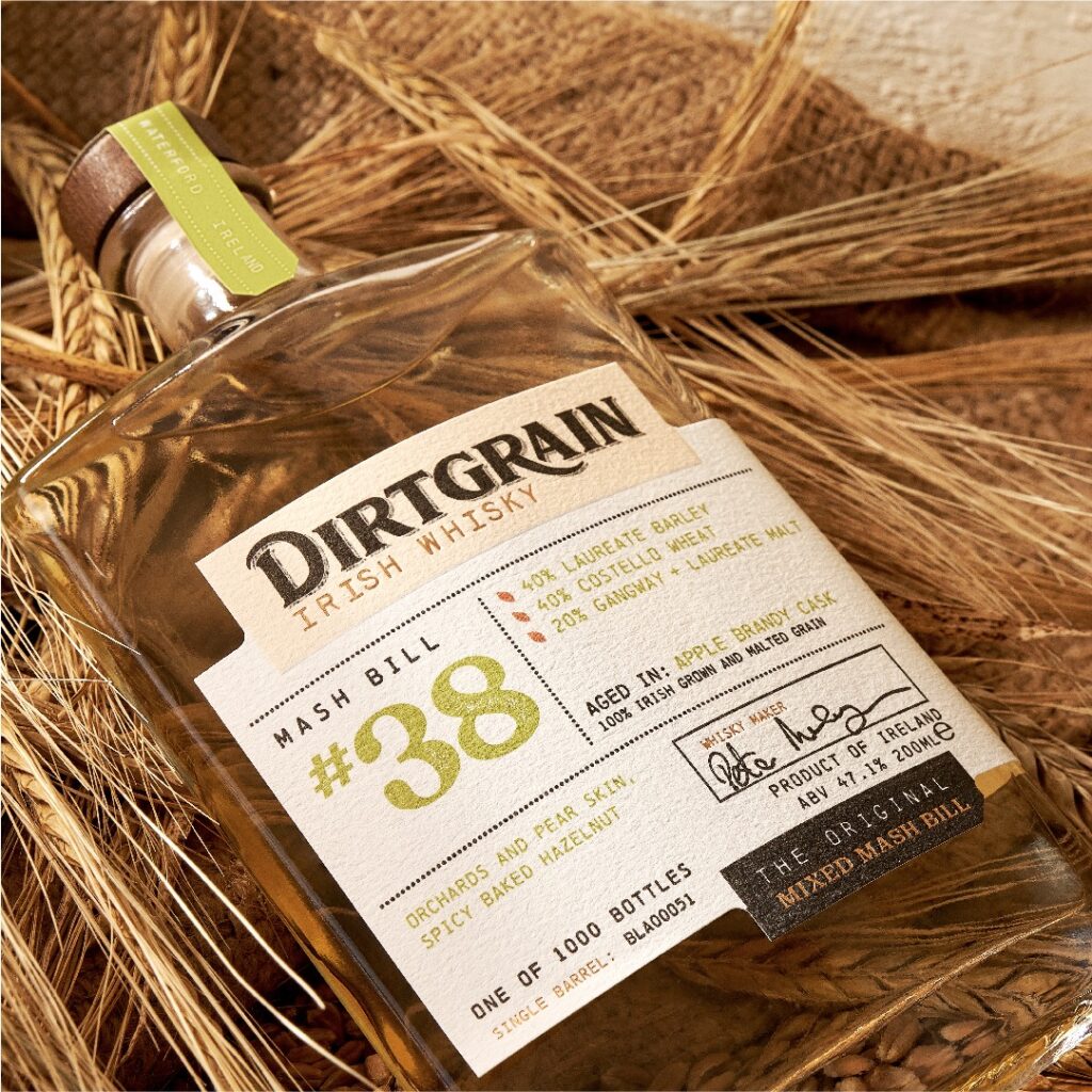
The bottle labelling features the Dirtgrain Irish Whisky brand identity on a three-part illusion label. Foil accents add premium cues to the pack and sit alongside the brand’s unique mash bill recipes and flavour profiles.
Limited to 1000 packs only, the pack was released via ballot ahead of Christmas 2022 and via selected specialist retailers.
Limited Edition / Packaging Design
Brand Refresh / Packaging Design / Website Design