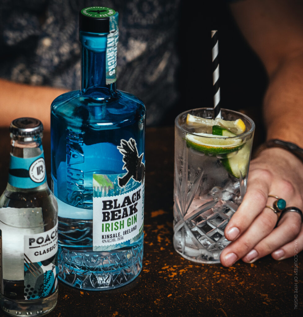
Bringing attitude to Ireland's first co-located brewery & distillery - Black Beak
Well-established Irish craft beer renegades ‘Blacks of Kinsale’ undertook a massive step in the expansion of their business with the opening of Ireland’s first co-located brewery and distillery. As part of this growth, we were tasked with refreshing the brand and delivering a clear and cohesive brand persona along with a full suite of packaging for their new products. Naturally unafraid of rules or boundaries within their creations, a new positioning of ‘Flavour Mavericks’ was born.
Beginning with their new Irish gin, inspired by their surroundings, we combined the crashing chaos of wild Atlantic waves, vibrant coastal flavours and thriving local art scene to create a unique piece of packaging in line with their new positioning.
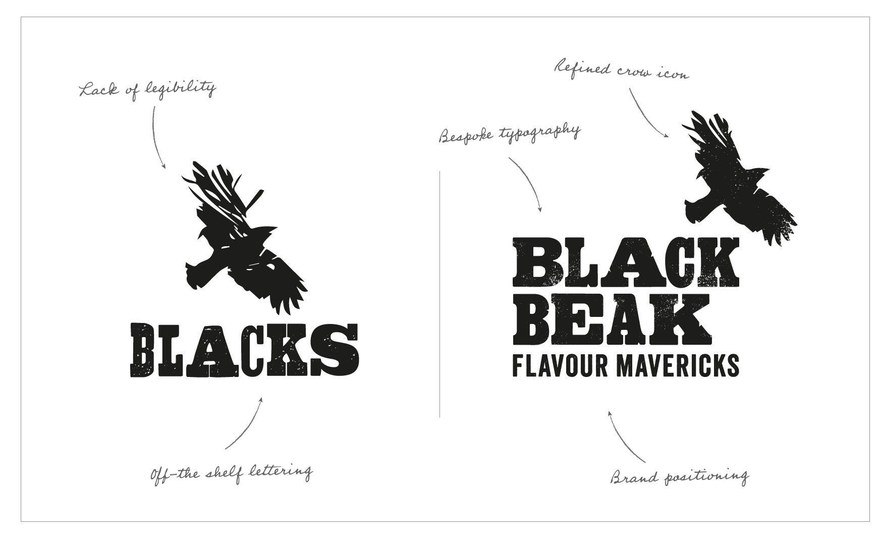
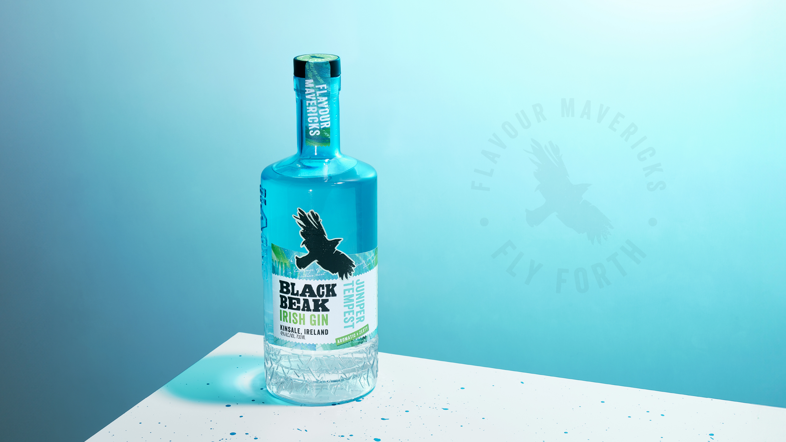
We began by recreating the existing Blacks brand marque into the new brand name ‘Black Beak’. The synonymous letterpress style typography and crow icon remain, emboldened and refined to reflect the premium nature of their products.
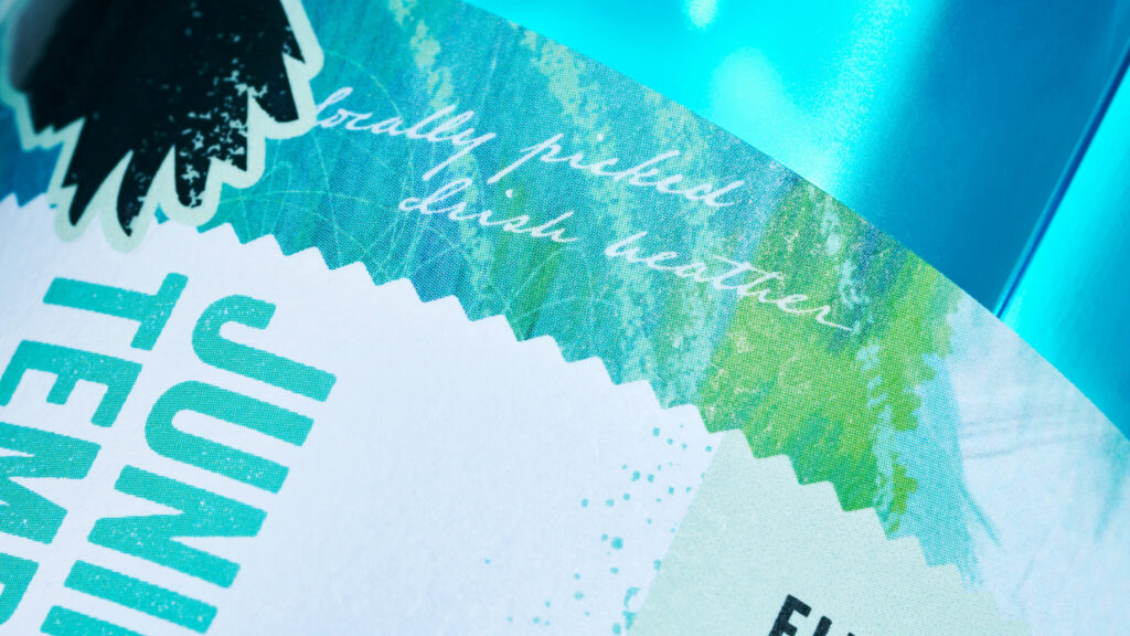
For their first gin release, titled ’Juniper Tempest‘, we created an illustration that blends the crisp, fresh flavours of the gin with inspiration from The Wild Atlantic Way – the coast near the brand’s home – with erratic brush strokes and swirls that mimic the movement of the waves crashing against the coastal rocks.
Strong colour coding of the bottle and label reinforces flavour and allows clear differentiation in product ranging for the future.
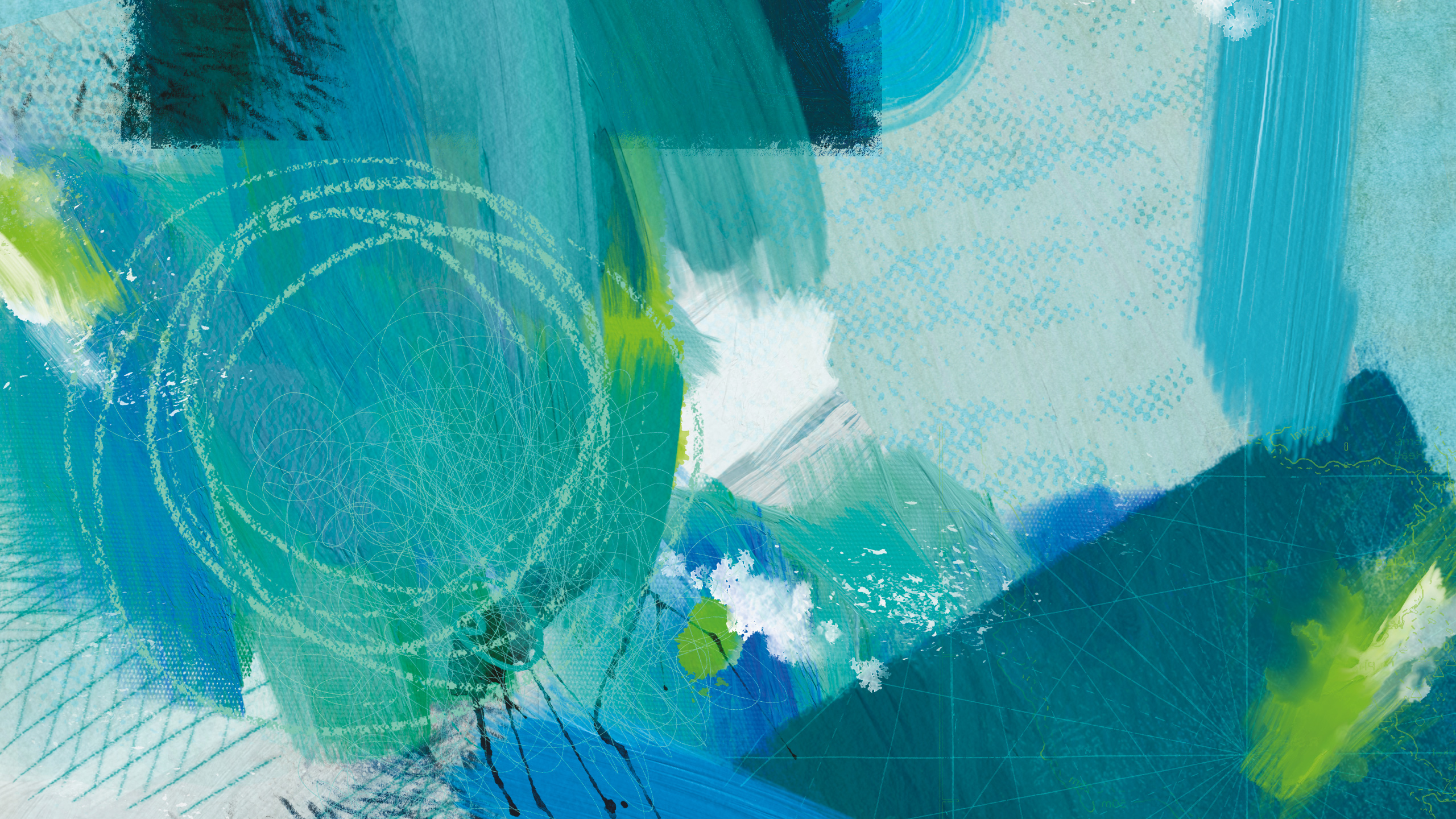

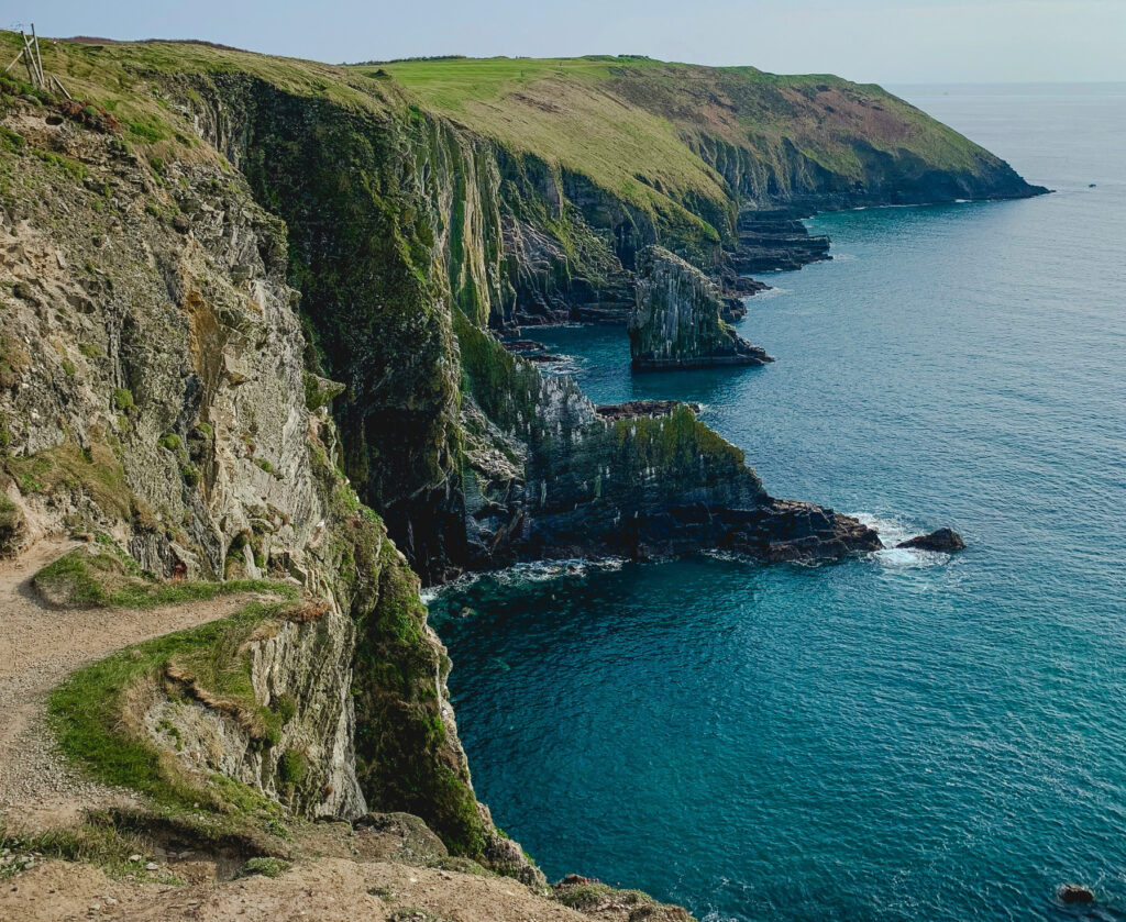

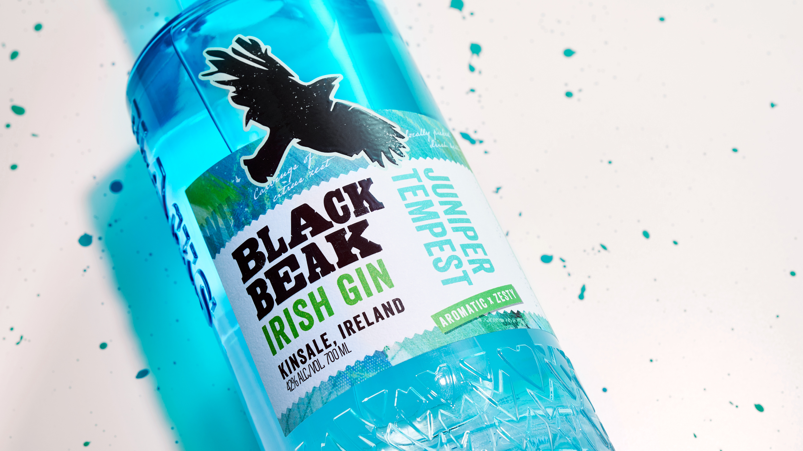
For the packaging we combined the bold black crow marque with a rebellious layout and premium label shape to create a blend of attitude and sophistication.
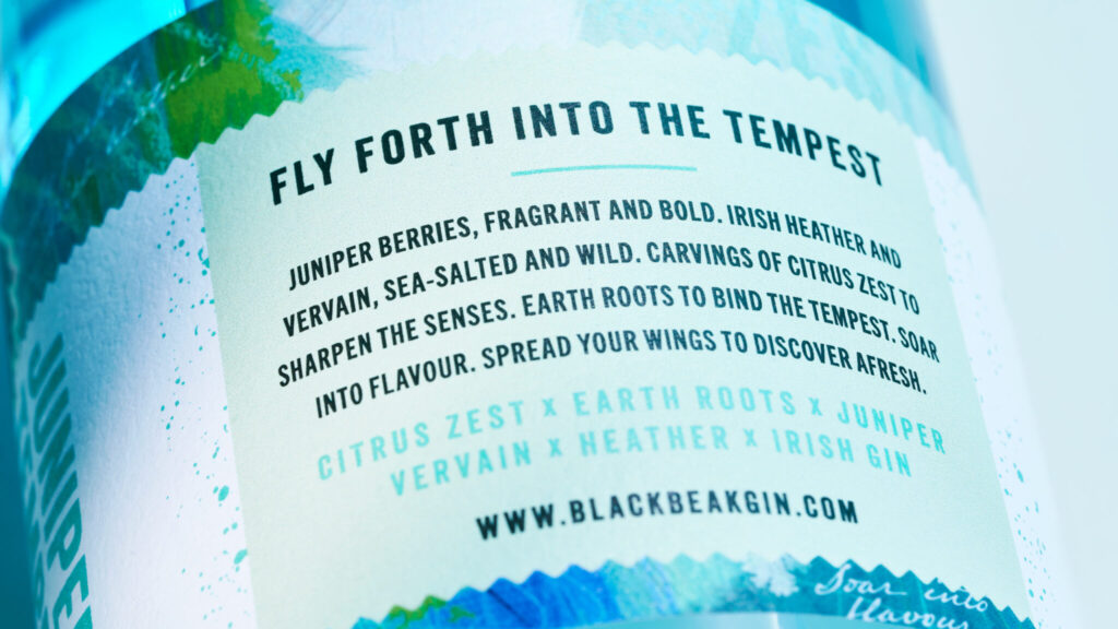
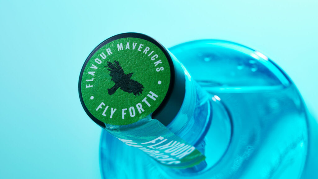
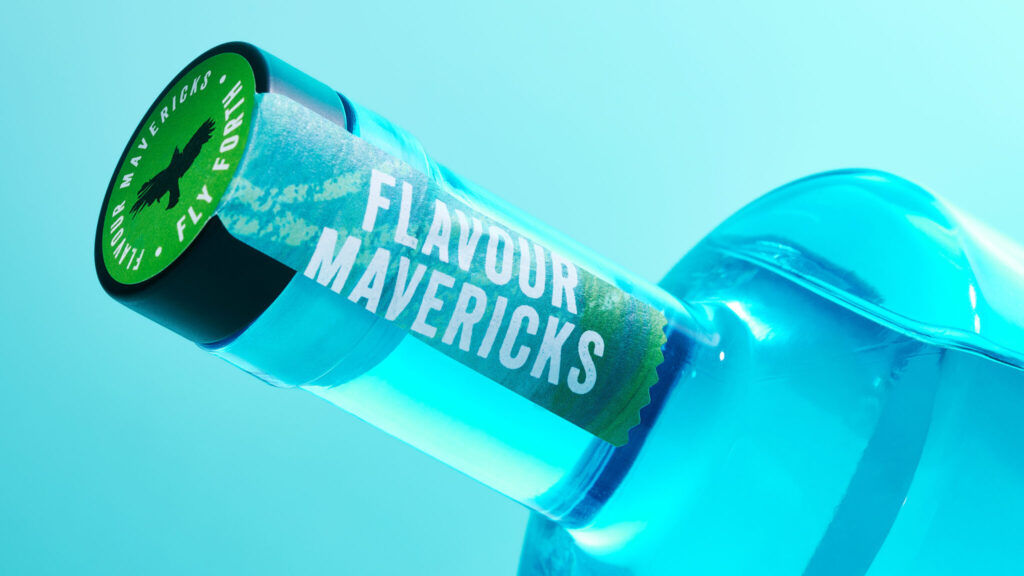
The abstract illustration and flavour text wraps the bottle, leading around to the romance copy, full of character and maverick spirit. Bespoke colouring and feather embossing were also added to the bottle, enhancing flavour cues and brand touch points.
Limited Edition / Packaging Design
Brand Refresh / Packaging Design / Website Design
