
Inspired Craft Beer With A Southern Twist – Appalachian Mountain Brewery
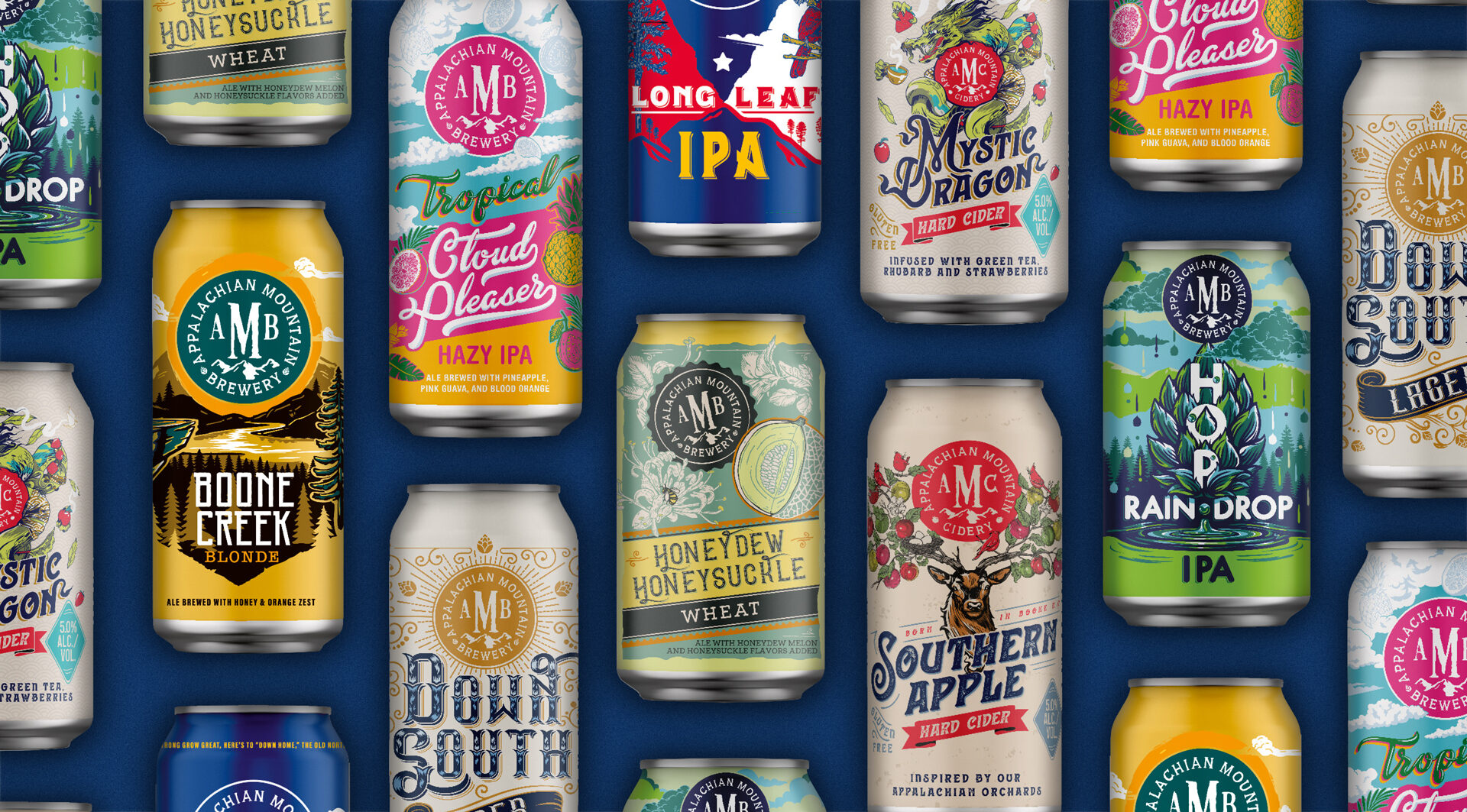
Our latest work with Anheuser Busch saw us rebrand Appalachian Mountain Brewery, one of their craft brewing partners. The rebrand and packaging redesign aims to bring alive the brand’s new positioning of Appalachian Mountain inspired crafts with a ‘southern twist’.
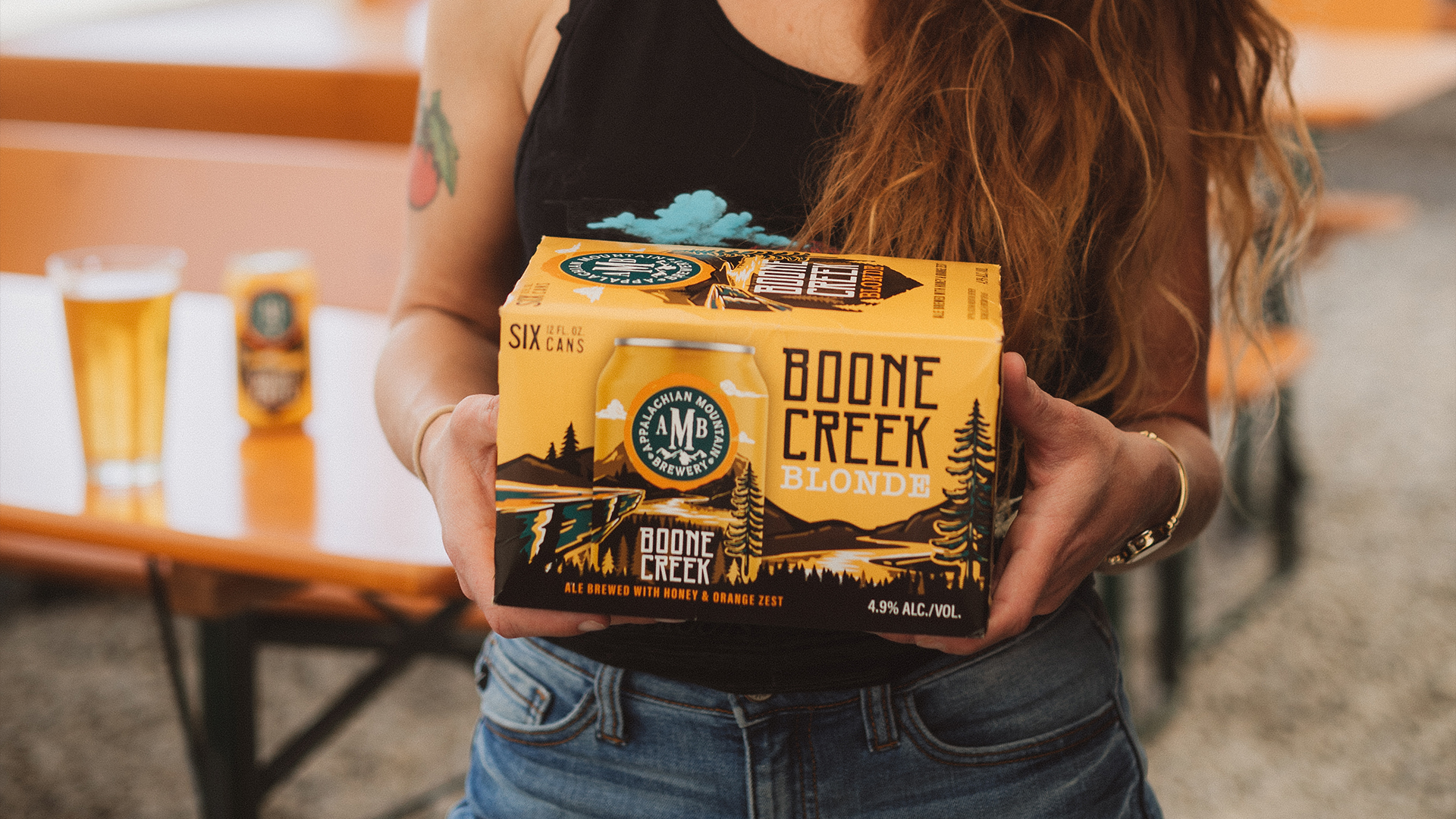
Inspired by the mountains that surround the brand’s hometown of Boone N.C. and its southern roots, the rebrand focuses on the ethos of ‘art on the inside and art on the outside’. This is reflected in the care and craftmanship of the brand’s beautifully balanced liquids, as well as the eclectic and often quirky visual brand DNA.
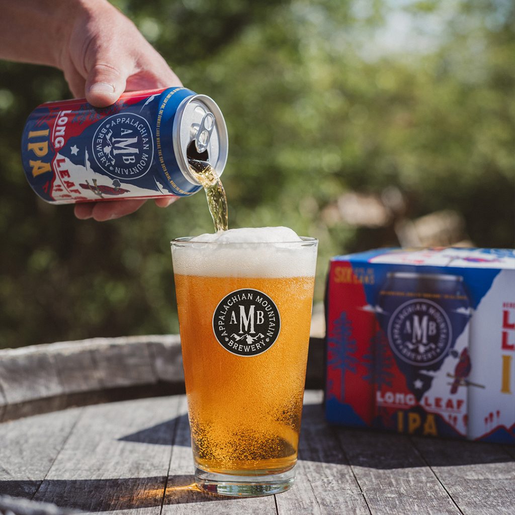
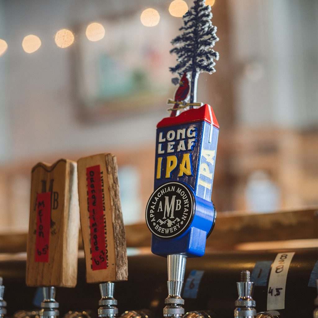
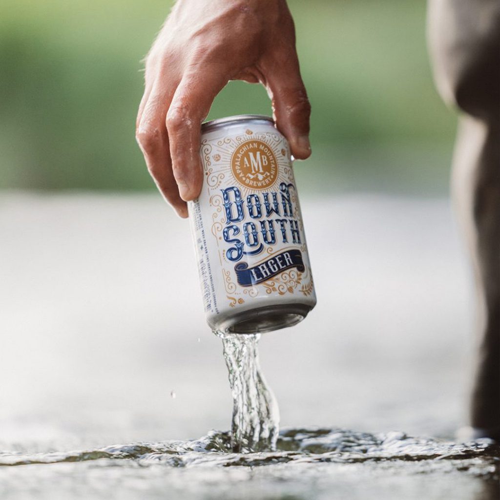
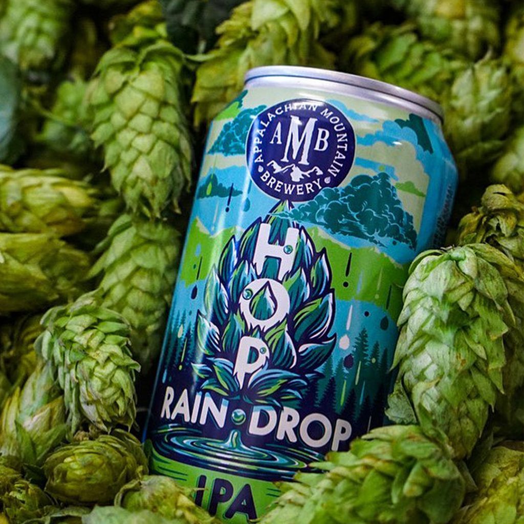
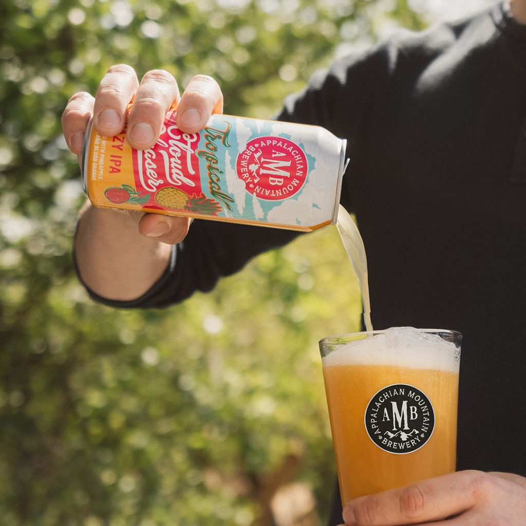
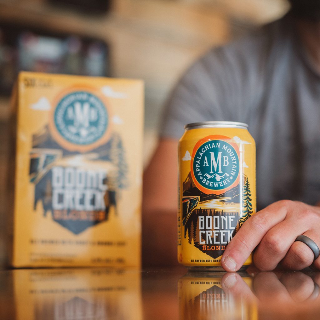
The redesigned brand marque, with strong AMB typeface, sits proud on the front face of each can and is integrated with impactful illustrations that wrap the can face. The brand is colourful and eclectic. Each variety uses colours that reflect the beer style and type, or the naming convention of the variant itself.
Illustration is very important to the AMB brand. It conveys the core brand proposition and provides characterful representation of the beer/cider styles and their brand names. Brought to life by artist Tommy Lee, it is mystical and whimsical and grounded in the inspiration behind the beer recipe to ensure the variants story is creatively captured.
Limited Edition / Packaging Design
Packaging Design